
01Who this is for
- Ecommerce store owners who want a consistent visual style across product listings.
- Marketing managers needing to match product card design to brand guidelines.
- Web designers looking to fine tune layout details for desktop, tablet, and mobile views.
02Product card customizations, explained
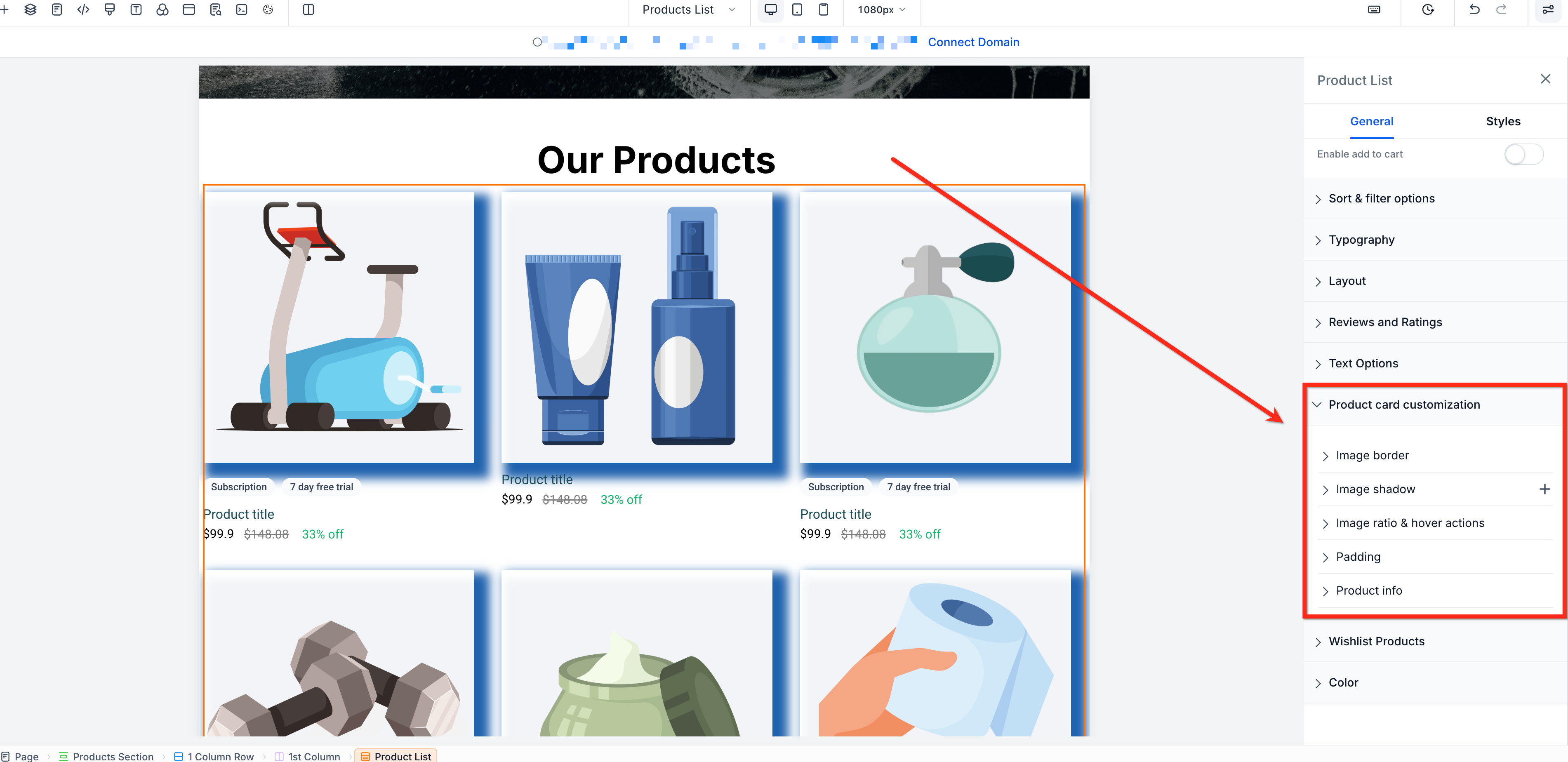
The product card customization feature lives inside the Store Builder. After selecting a component such as Product List, Featured Products, or Collection, you open the Product Card Customization panel to adjust styling. Options include borders, shadows, image ratios, hover effects, padding, and information alignment.
Each option works only for the components listed next to it. Borders, shadows, image ratio, and product info settings are available for all three components, while padding applies solely to Product List. Hover effects appear on desktop for Product List and Featured Products only. Settings persist until you change them again.
03How businesses use product card customizations
- Fashion boutique. The boutique selects the Product List component and uses Borders to set a thin gold outline, Shadows to add depth, and Image Ratio to keep photos square. They also align product names to the center for a balanced look.
- Electronics retailer. The retailer activates the Show second image on hover for Featured Products, enabling shoppers to see alternate angles. They add an outer shadow and adjust its color to match the site theme.
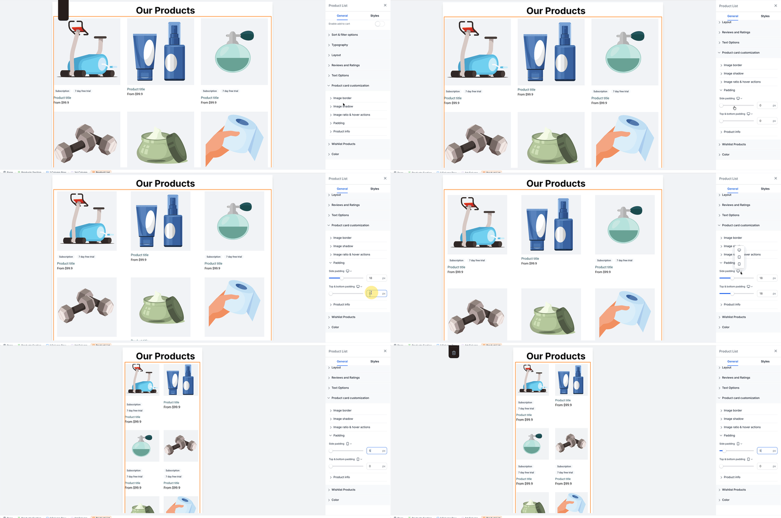
- Handmade crafts marketplace. The marketplace configures separate padding values for Desktop, Tablet, and Mobile on the Product List cards, ensuring adequate spacing on each device size.
04The numbers and rules that matter
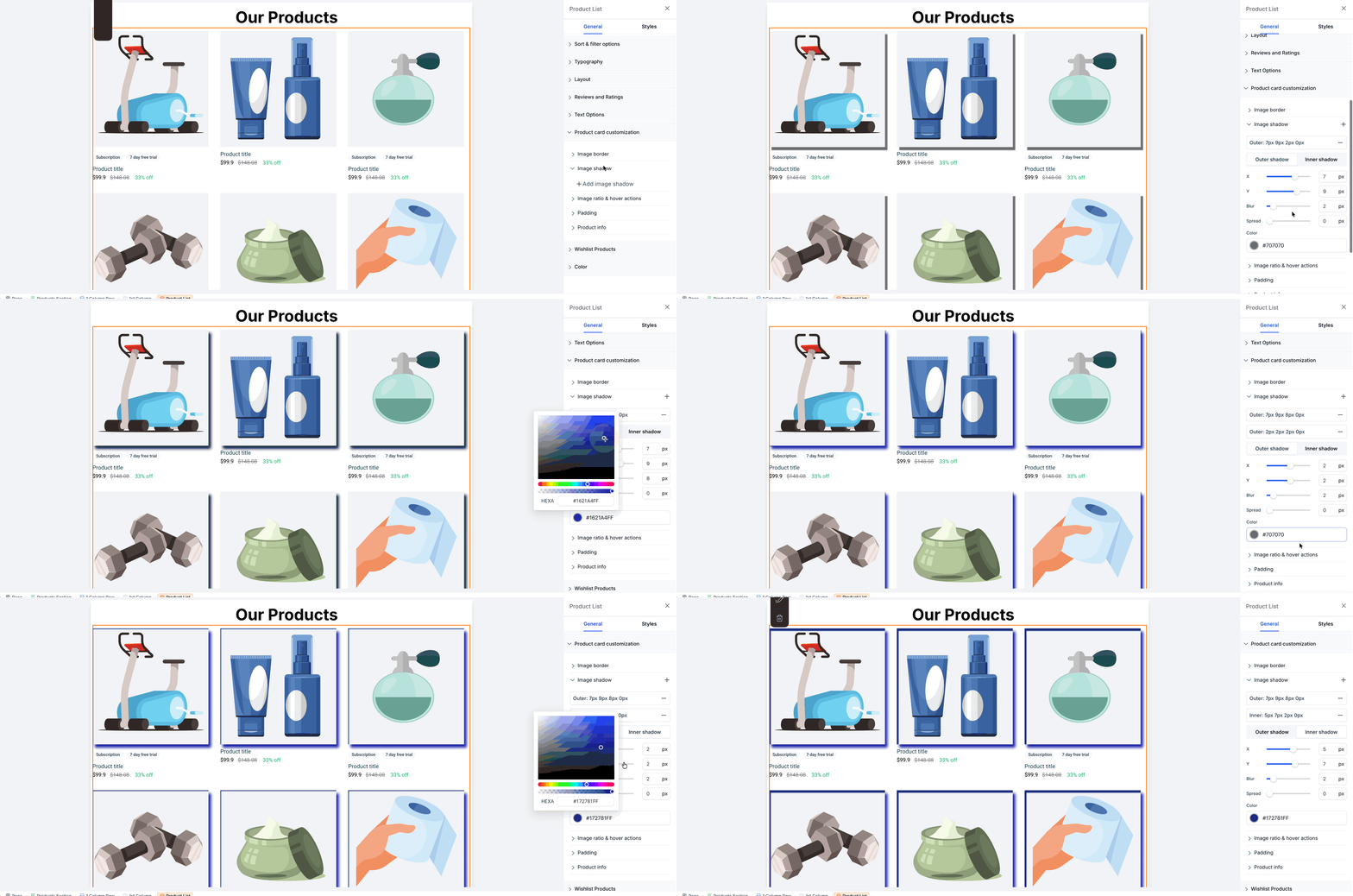
- You can stack up to 5 shadows using the + icon.
05How to set up and use product card customizations in HighLevel
Open product card customization
- Open the Store Builder from the HighLevel dashboard.
- Select a supported component such as Product List, Featured Products, or Collection.
- In the component settings, choose Product Card Customization.
- Note: Existing product card layouts keep their current styling until you modify these settings.
06What it looks like in HighLevel
07Settings that matter
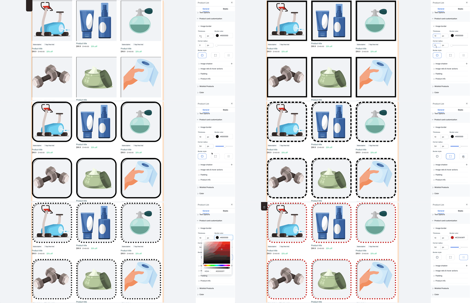
- Borders. Controls the thickness, radius, color, and style of the border around product images.
- Shadows. Adds inner or outer shadows to product images and lets you set offset, blur, spread, and color, with a maximum of five stacked shadows.
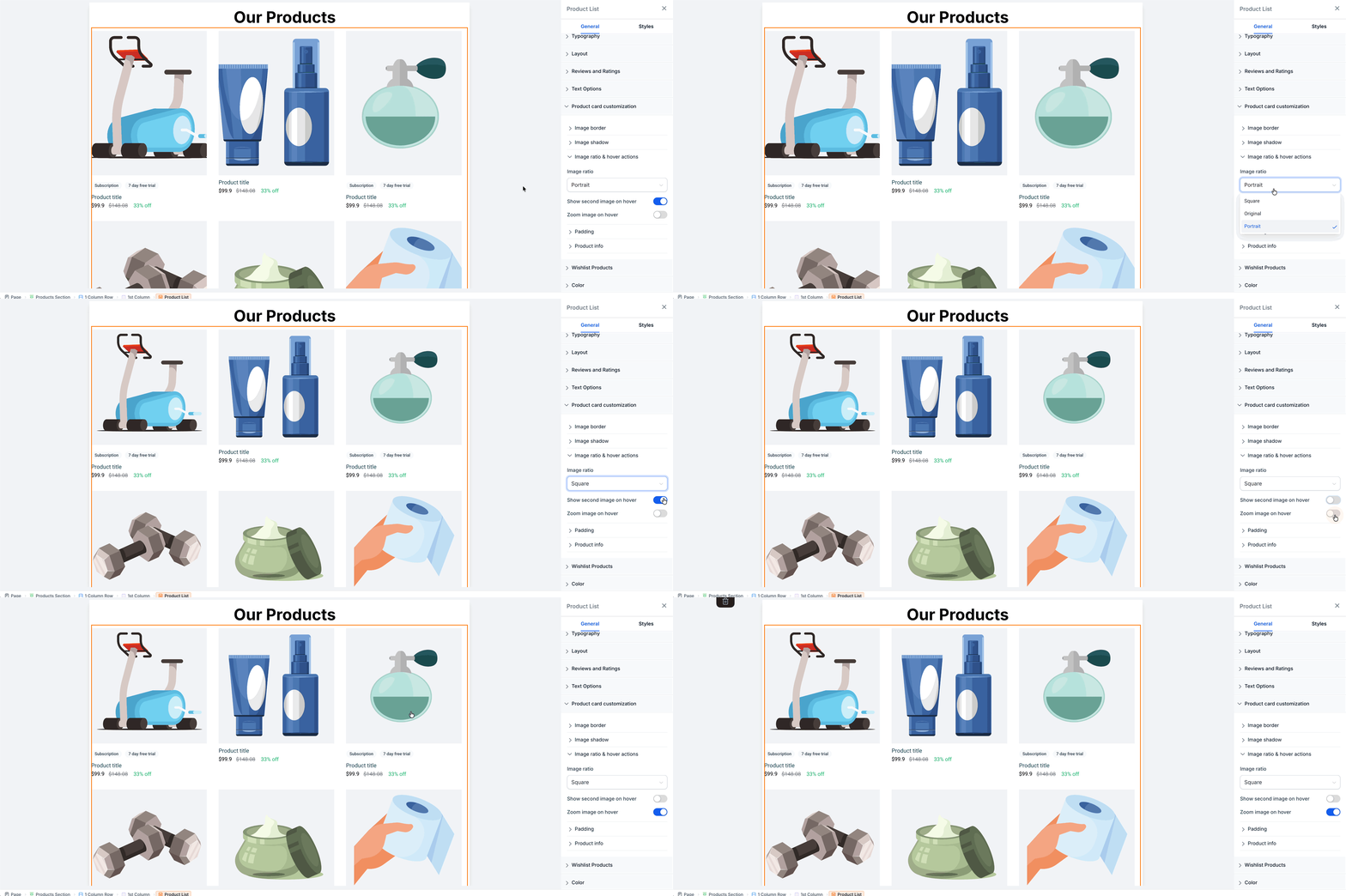
- Image Ratio and Hover Effects. Sets the fit of product images as Square, Portrait, or Original, and optionally shows a second image or zooms on hover.
- Product Card Padding. Adjusts the internal spacing of each product card, with separate values for Desktop, Tablet, and Mobile.
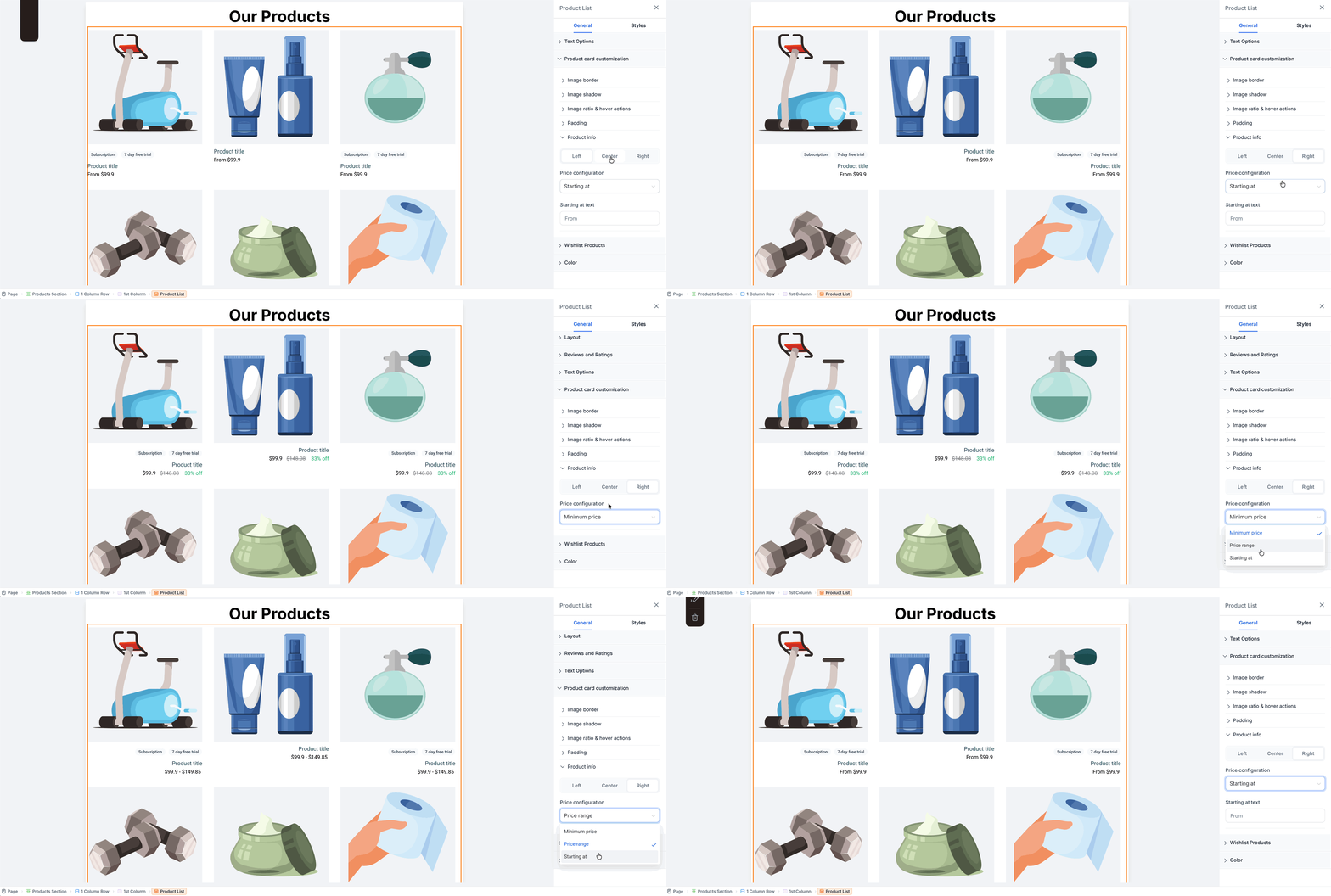
- Product Info and Price Configuration. Aligns the product name, price, and other details left, center, or right, and controls how pricing appears on the card.
08Things to know before you rely on it
- Shadows can be stacked up to five layers using the + icon.
- Hover effects work only on Desktop for Product List and Featured Products.
- Product Card Padding is available only for the Product List component.
- Image Ratio, Borders, Shadows, and Product Info settings apply to Product List, Featured Products, and Collection.
09How it connects to the rest of HighLevel
- Set up an ecommerce store Ecommerce store setup
- Configure shipping zones and ZIP limits Shipping settings
- Connect Stripe for payments Stripe integration
Get More InformationOpens on HighLevelPublished November 3, 2026 · Updated November 17, 2026