
01Who this is for
- Anyone building pages in the Page Builder can set precise element dimensions.
- Users who need responsive layouts can define separate sizes for desktop and mobile.
02Container size controls, explained
Container Size is a control inside the Page Builder that lets you set the height and width of an element without writing CSS. The values you enter determine how much space the element occupies inside its parent column, row or section.
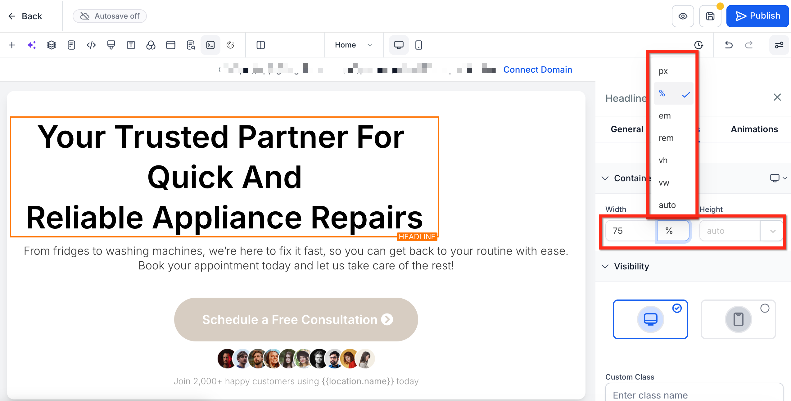
You can pick from five units, px, %, em/rem, vh/vw, or auto, to match the layout goal. The control also supports decimal numbers, enabling precise percentages like 33.33%.
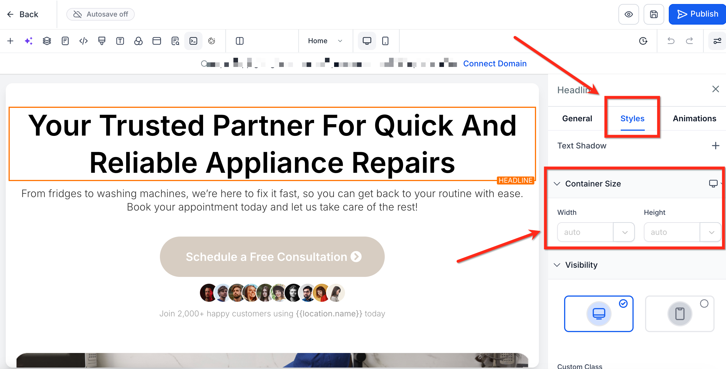
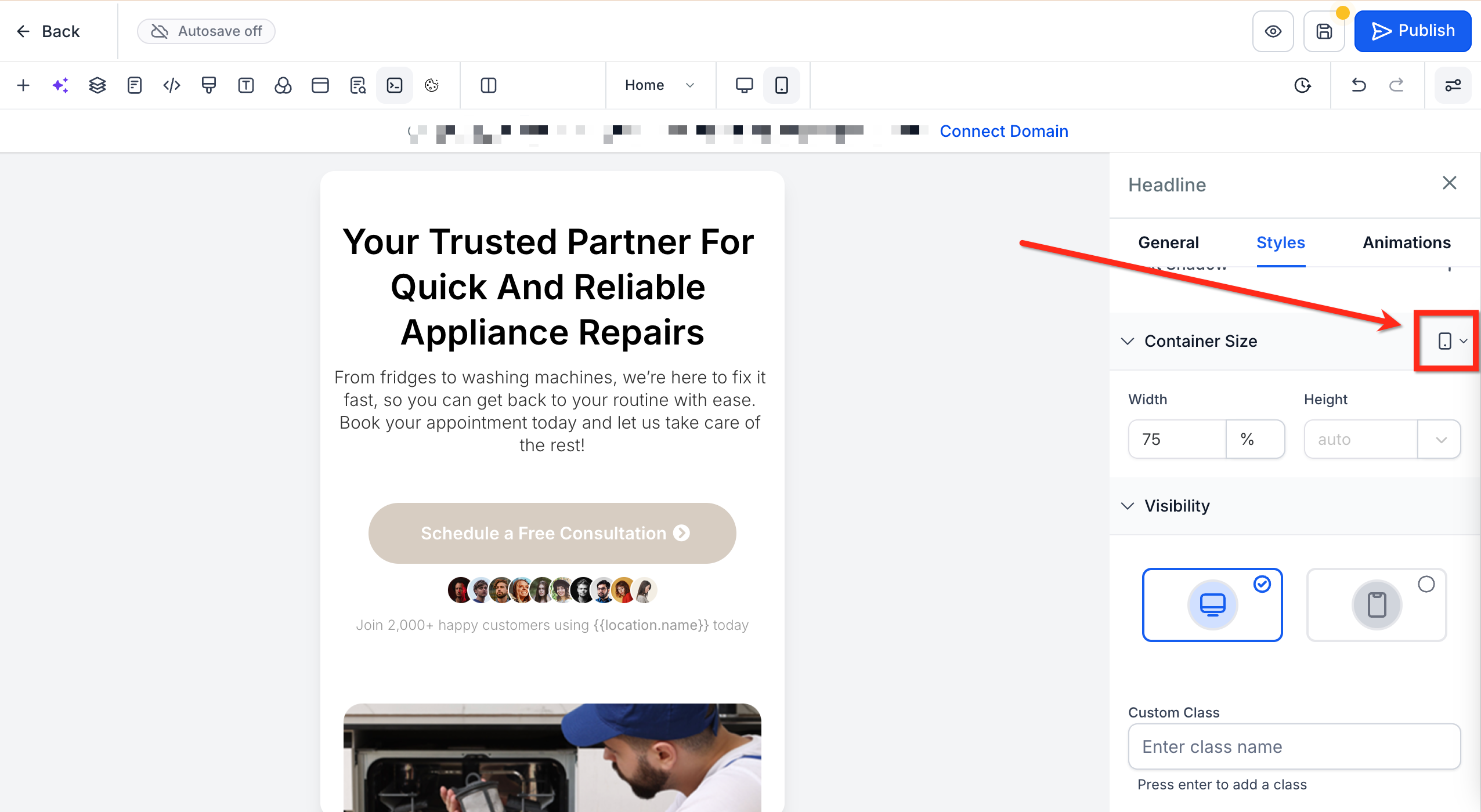
The settings appear in the Styles tab of the right sidebar under the Container Size section. A device toggle lets you enter different dimensions for desktop and mobile, keeping each view independent.
03How businesses use container size controls
- Digital marketing agency. Select a headline block, set its width to 80% using the percent unit, and adjust the height to 200px. This keeps the headline responsive while matching the design guide.
- Online course creator. Open a video embed element, choose vw as the unit for width, and enter 90. Switch to mobile view and set the width to 100% so the video fills the screen on phones.
- Real estate lead capture page. Resize a form container by setting its height to auto and width to 400px on desktop, then change the mobile width to 95% for a full screen experience on smaller devices.
04The numbers and rules that matter
- Supported units: Px, %, em, rem, vh, vw, auto.
05How to set up and use container size controls in HighLevel
Edit container size
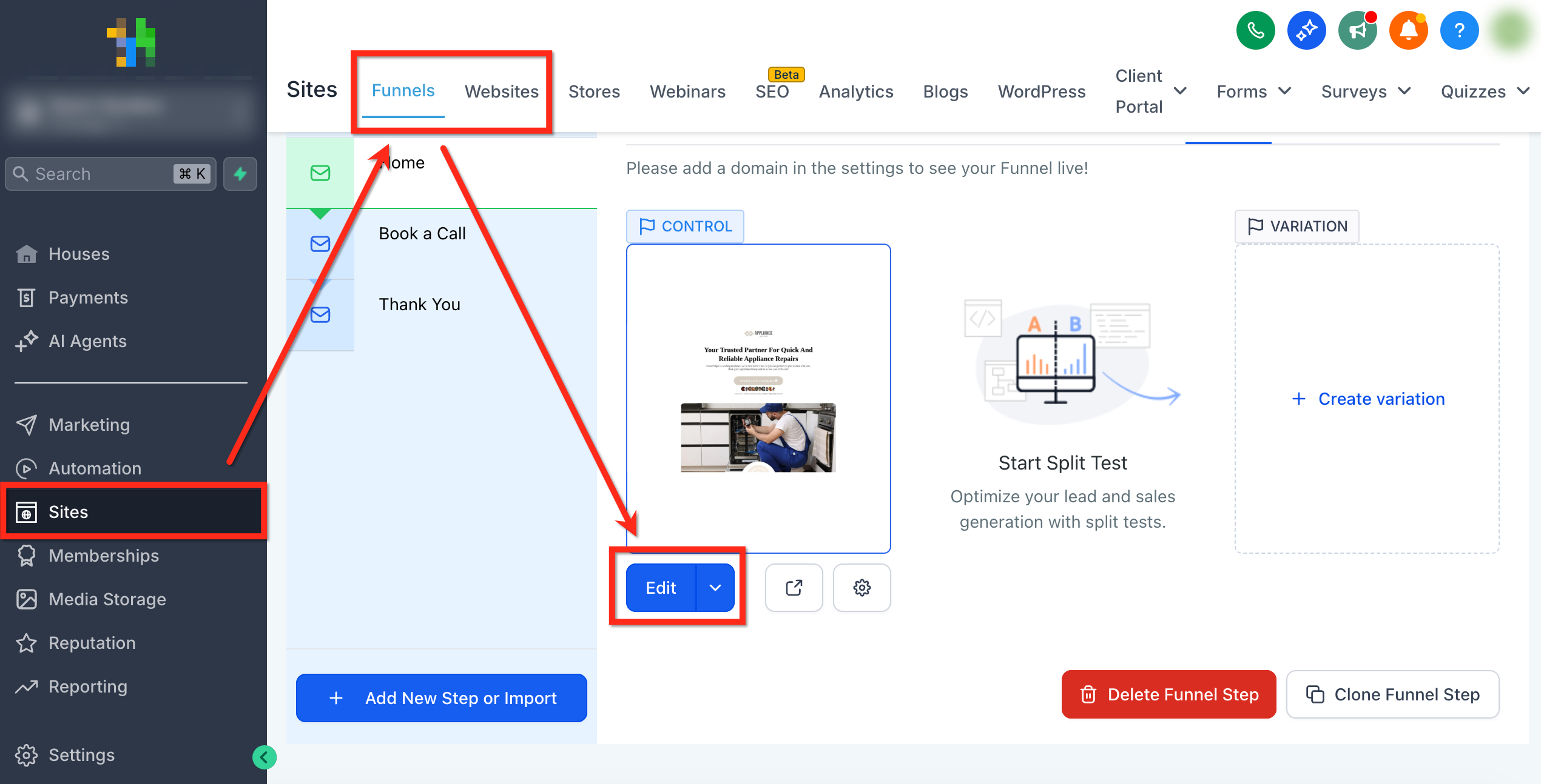
- Navigate to Sites > Funnels or Websites, pick the funnel or site you need, and open the page editor.
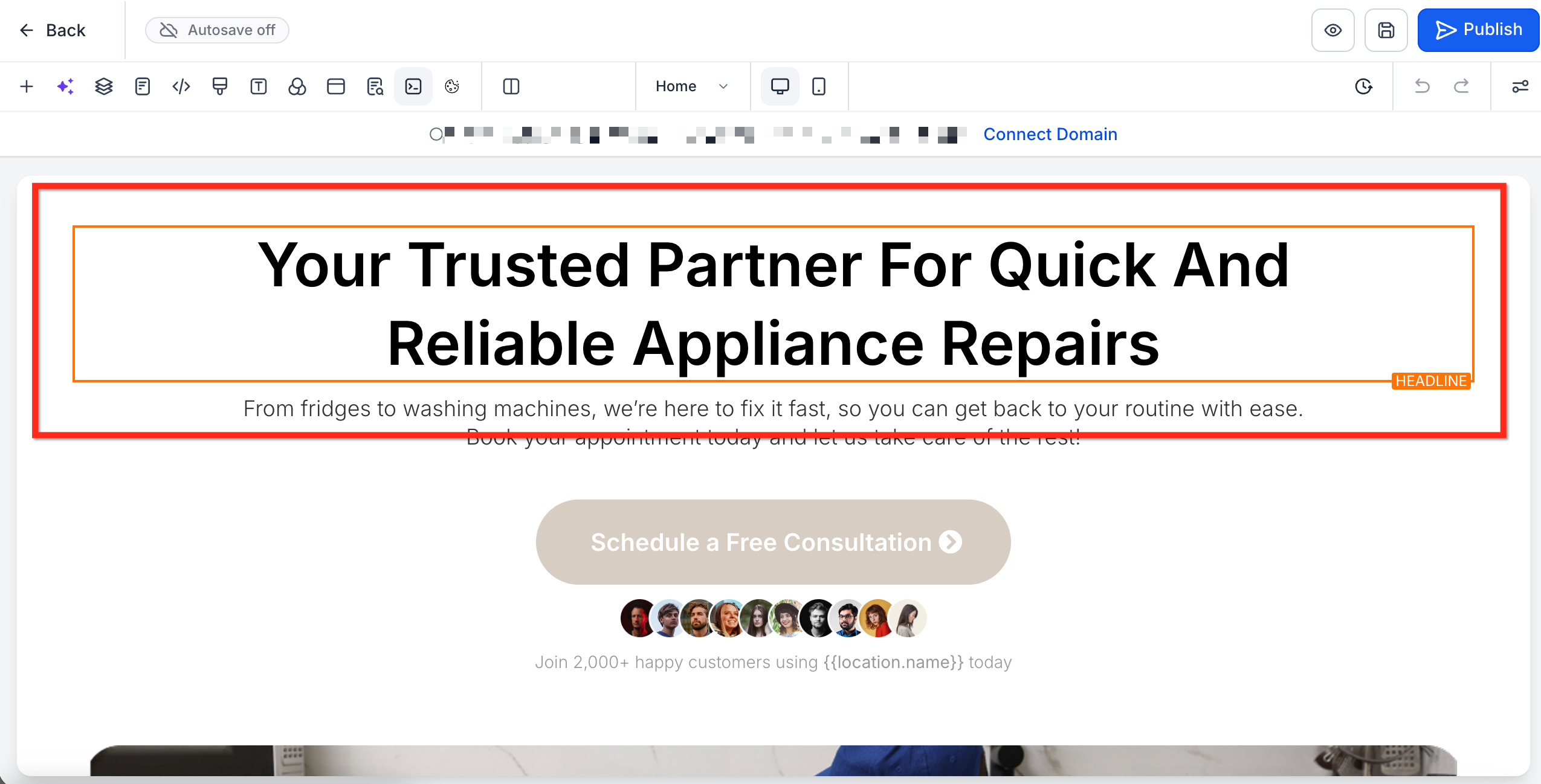
- Click the element you want to resize.
- In the right sidebar open the Styles tab and scroll to the Container Size section.
- Select a unit from the dropdown next to Height and Width, then type the desired numeric value for each.
- Use the device toggle beside Container Size to switch to Mobile view and enter mobile specific dimensions if required.
06What it looks like in HighLevel
07Settings that matter
- Height. Defines the vertical size of the selected element using the chosen unit.
- Width. Defines the horizontal size of the selected element using the chosen unit.
08Things to know before you rely on it
- Negative numbers and zero are not accepted for height or width; entering such values leaves the element unchanged.
- Decimal values are allowed, so you can set sizes like 33.33% for precise column layouts.
09If something goes wrong
- Need to revert custom sizing. Set the unit to auto to return the element to its natural size.
- Entered a negative or zero value. The element will keep its current size; use a positive value instead.
10How it connects to the rest of HighLevel
- Learn how to set up a full website and check mobile settings before launch. Website setup overview
- Add scroll to element links to improve navigation on pages that use precise element sizing. Scroll to elements guide
- Explore how to add click to call and click to email buttons alongside sized buttons for better interaction. Click to call links
Michael's take

Container size controls are a niche feature that only matters if you need pixel perfect layouts. Skip it if you are happy with the default auto sizing and simple margin tweaks.
The feature shines when you are building complex multicolumn sections that must stay consistent across devices.