
01Who this is for
- Marketing managers can fine tune button and image borders to match brand guidelines.
- Web designers can create distinct section dividers by setting different side widths.
- Small business owners can add visual emphasis to calls to action without external design tools.
02Border controls, explained
Border control adds a centralized panel that governs the appearance of borders on supported Page Builder elements. You can pick a border style, choose a color, define widths for each side, and set corner roundness either uniformly or per corner. The panel works inside both Funnels and Websites, so any element that supports it, such as a button, an image, or a video, can be styled without manual CSS.
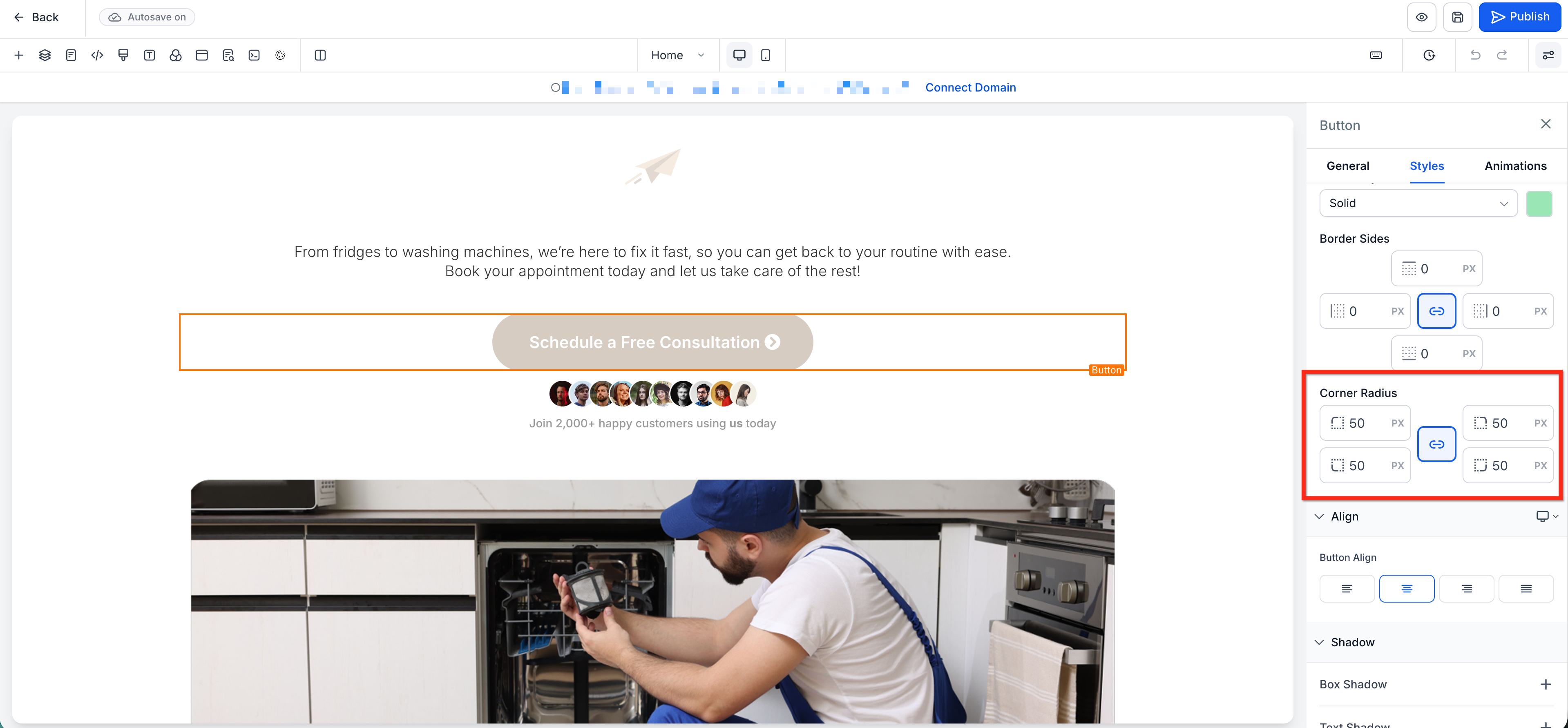
When you open the Styles tab for an element, the Border panel appears with four main controls. Selecting a style changes the visual pattern of the edge, while the color picker defines its hue. The Border Sides control lets you link all sides to a single width or unlink them to set top, right, bottom, and left individually. Corner Radius works the same way for rounding each corner separately.
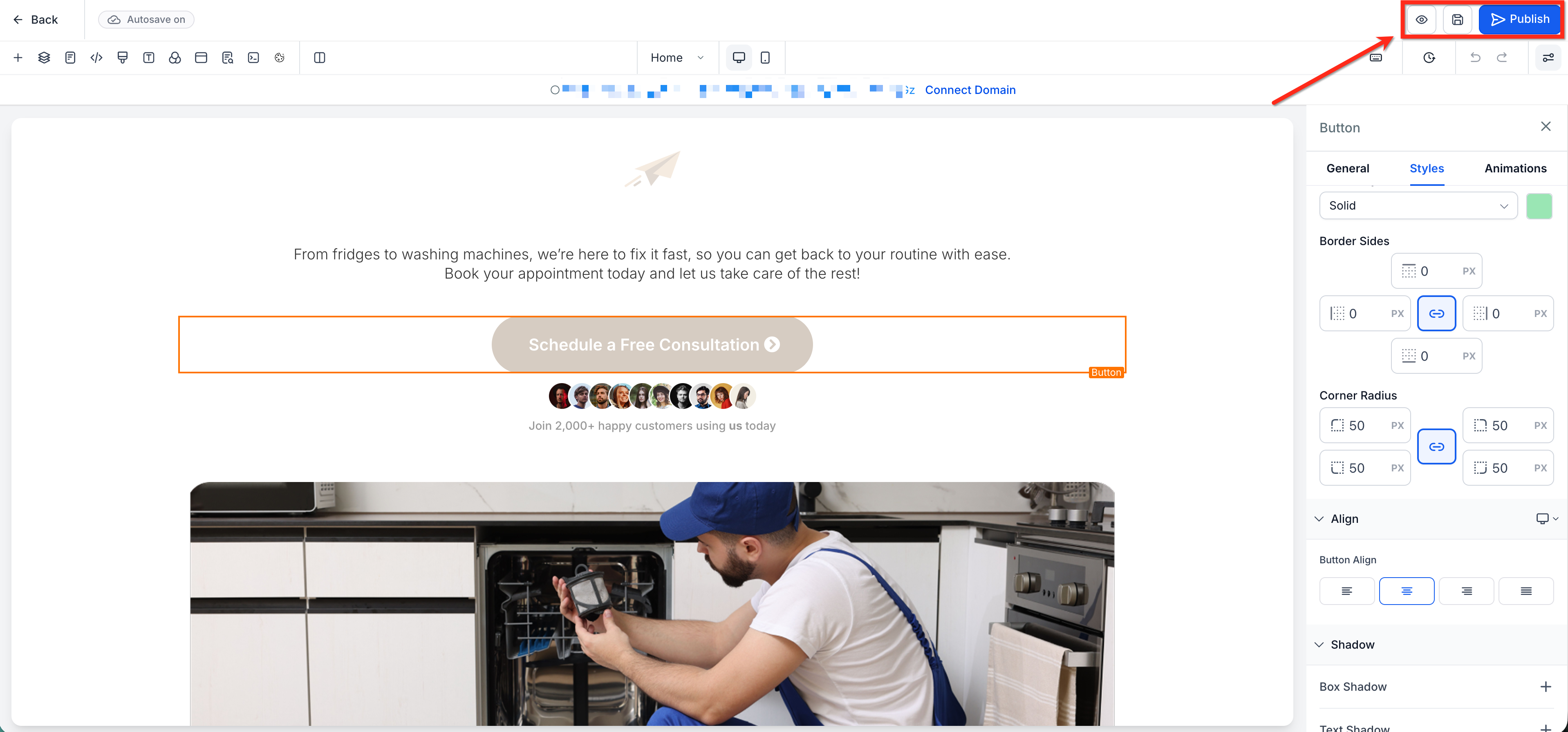
The feature lives in the Page Builder editor. From a Funnel or Website, choose an element, go to the right hand sidebar, open the Styles tab, scroll to the Border panel, and adjust the settings. Changes preview right away on the canvas and are saved when you publish the page.
03How businesses use border control
- Dental practice. Select the appointment booking button in the page builder. Use Border Control to match the clinic's primary color, set a uniform border width, and round the corners for a softer look. Preview and publish so the button reflects the practice branding.
- Real estate agency. Choose a property image element and apply a double border style to highlight featured listings. Unlink the Border Sides to give the top edge a thicker width than the other sides, creating a visual divider. Save the changes to make the listings stand out.
- Online course platform. Open a video element that shows tutorial content. Set an inset border style and round each corner independently for a modern frame. Adjust side specific widths to add a thin line on the bottom only, then publish the updated lesson page.
04The numbers and rules that matter
- Supported elements: Button, Image, Video.
- Border styles include: Double, groove, ridge, inset, outset.
05How to set up and use border control in HighLevel
Set up border control
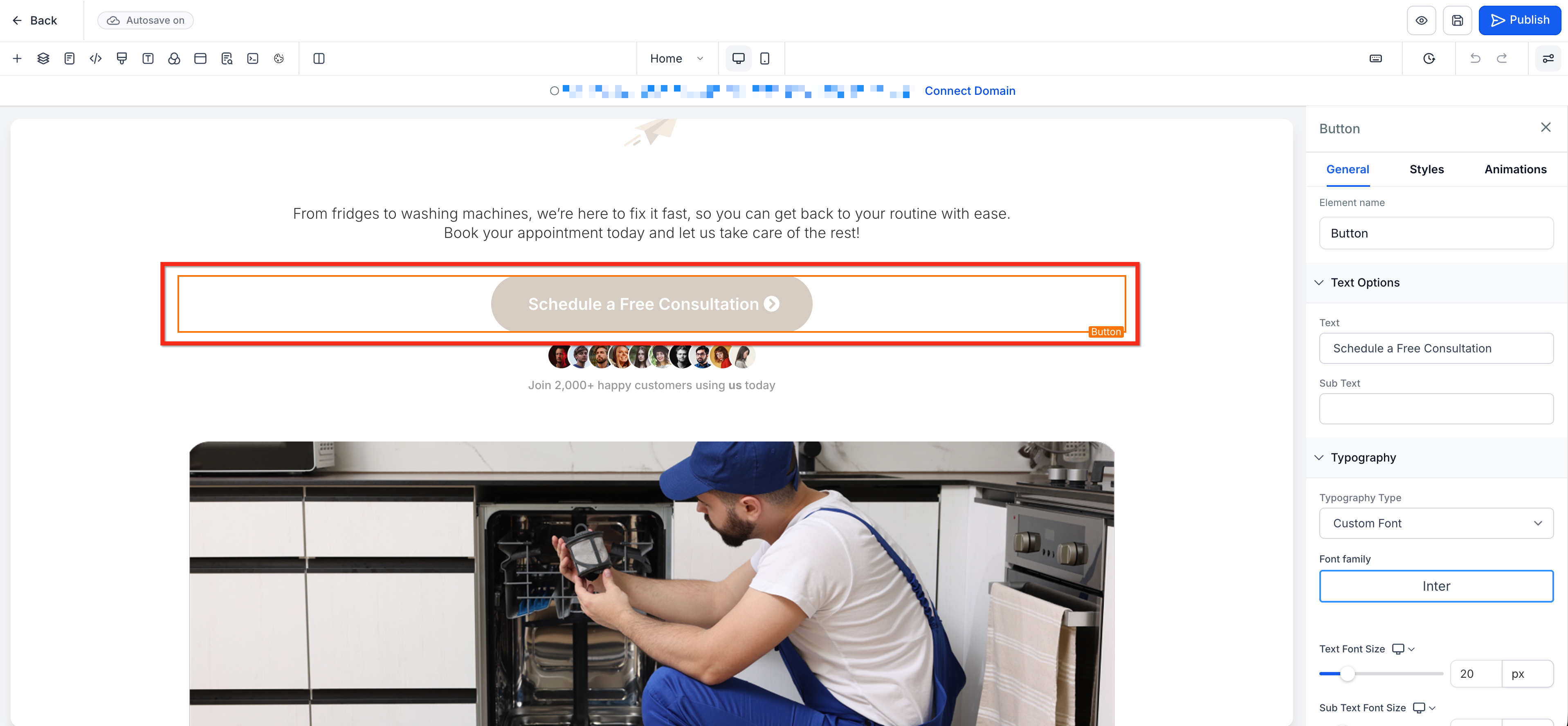
- In a Funnel or Website, click a supported element such as a Button, Image, or Video.
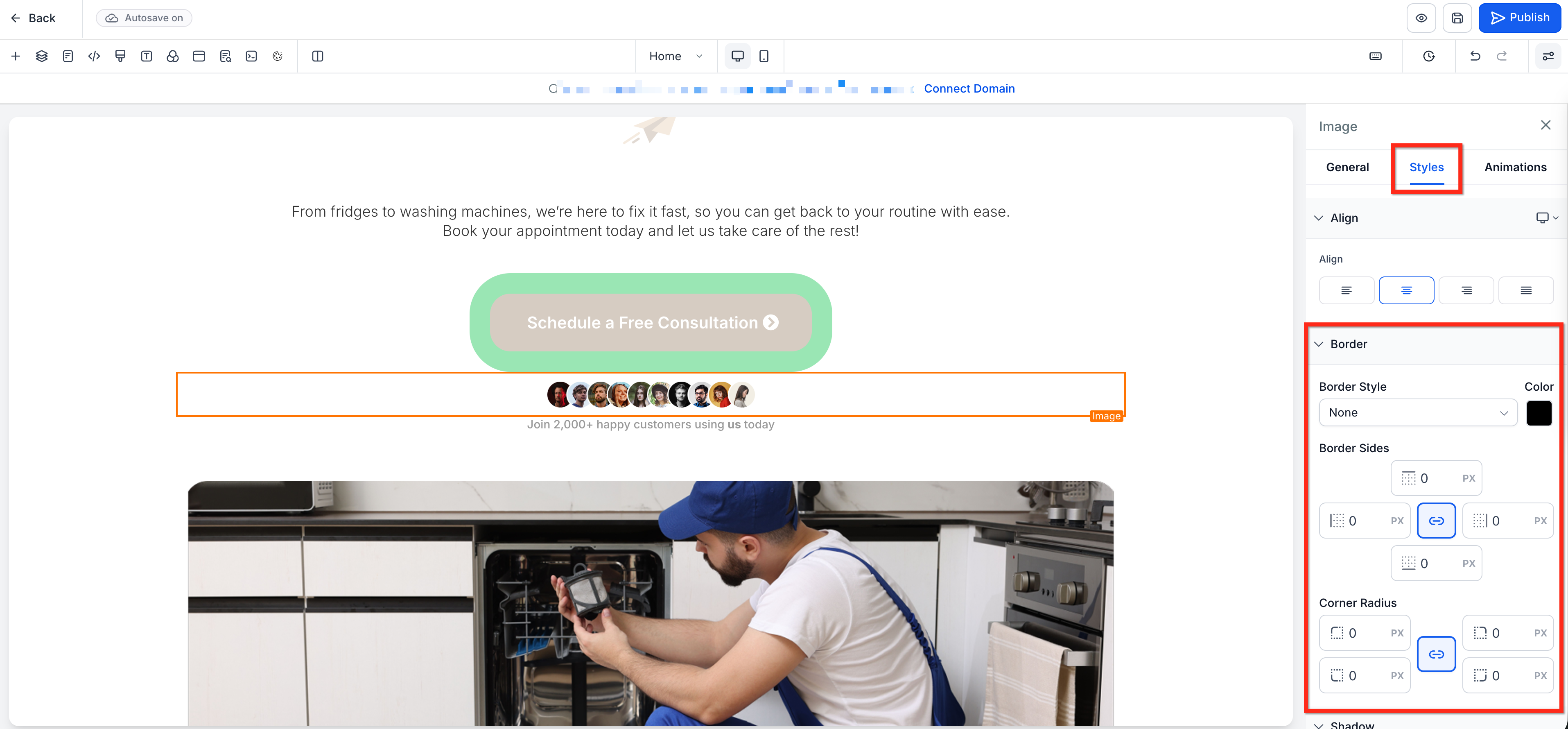
- Open the Styles tab in the right sidebar and scroll down to the Border panel.
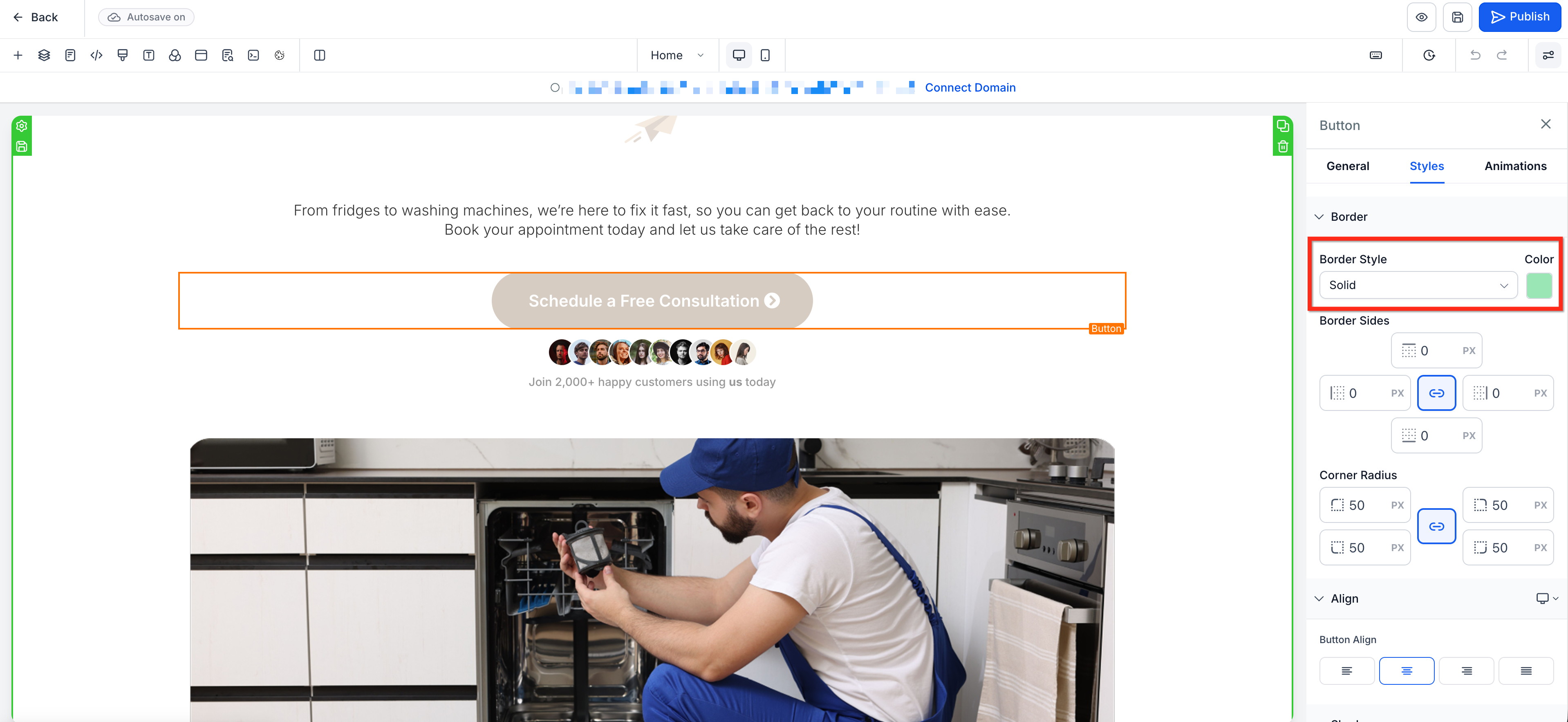
- Choose the desired Border Style and pick a Border Color.
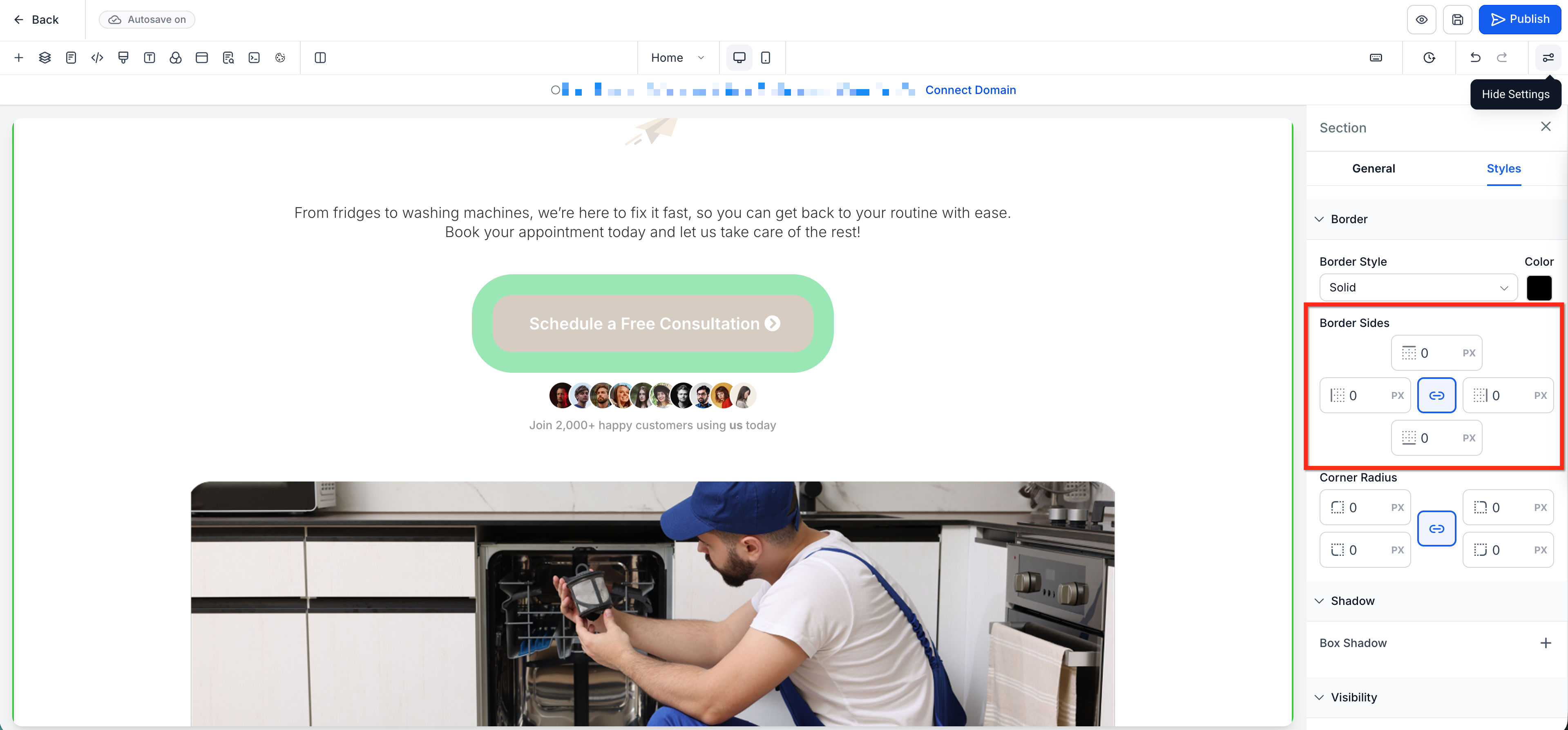
- Adjust the Border Sides values; keep them linked for equal widths or unlink to set each side separately.
- Adjust the Corner Radius values; keep them linked for uniform rounding or unlink to customize each corner.
- Use the canvas preview to review the element and tweak settings as needed.
- Save the page and Publish the changes when satisfied.
06What it looks like in HighLevel
07Settings that matter
- Border Style. Controls the visual pattern of the element’s edge, such as solid, double, groove, ridge, inset, or outset.
- Border Color. Sets the color applied to the element’s border.
- Border Sides. Defines the width of the border on each side; values can be linked for a uniform width or unlinked for individual side control.
- Corner Radius. Adjusts how rounded each corner of the element appears; values can be linked for the same radius on all corners or unlinked for independent corner shaping.
08Things to know before you rely on it
- Border Control works only on supported Page Builder elements such as Button, Image, and Video.
- Supported elements may differ depending on the builder context and feature rollout.
09If something goes wrong
- Cannot edit each side of the border separately. Click the link icon in the Border Sides control to unlink the values and set each side individually.
- Unable to edit each corner radius independently. Click the link icon in the Corner Radius control to unlink the values and customize each corner separately.
10How it connects to the rest of HighLevel
- Learn how to reuse element templates for faster design work. Element templates
- Add QR code elements to your pages for quick phone scanning. QR code element
- Review the overall website setup process before launching. Website overview
Michael's take

If I were laying out a new landing page, I’d use the side specific width to add a subtle divider under a headline button, then tweak the corner radius for a softer feel. Test a few variations, then lock in the look before publishing.