
01Who this is for
- Founders who send newsletters and need a consistent brand look on phones.
- Small business owners who run email campaigns and want tap friendly buttons on mobile.
- Marketing managers who must ensure images and icons scale properly for narrow screens.
02Mobile view controls, explained
Mobile View Controls are options inside the Email Builder that let you set separate values for mobile devices. When you enable a mobile override, the selected setting uses the mobile specific value; otherwise it inherits the desktop setting.
You access these options while editing an email template or campaign. After choosing an element, the styling panel shows Desktop and Mobile tabs. Enable the mobile toggle, enter the new values, and the changes affect only supported email clients that read responsive CSS.
The feature lives in the Design Editor of the Email Builder. It works alongside Device Visibility, which hides or shows content, and the preview tools that let you view both Desktop and Mobile renderings.
03How businesses use mobile view controls
- Real estate agency. The agency edits its listing newsletters, switches button alignment to full width on Mobile, and reduces padding so property details fit on small screens. All changes are made inside the Email Builder’s Mobile styling tab.
- Fitness studio. The studio updates its class schedule emails, enlarges social icons for mobile, and tweaks image dimensions. Each adjustment is performed via the Mobile controls for the Social element and the Image element in the builder.
- Online retailer. The retailer customizes promotional email buttons to be larger and full width on Mobile, ensuring easy tap targets. The modifications are applied through the Mobile button typography and spacing settings within the Email Builder.
04Before you start
- Open an existing email template or campaign in the HighLevel Design Editor.
05How to set up and use mobile view controls in HighLevel
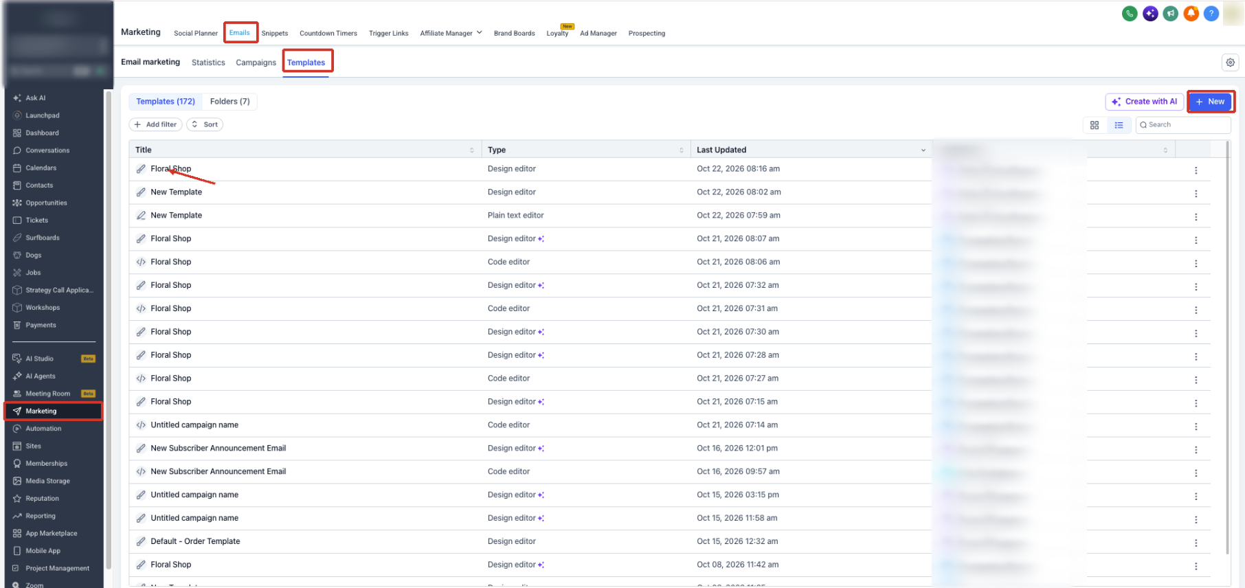
Open Email Builder
- Navigate to the Marketing menu in your HighLevel subaccount.
- Select Emails from the submenu.
- Open the Templates or Campaigns section.
- Choose an existing email or create a new one.
- Enter the Design Editor to start editing.
Select desktop or mobile styling
- Click the element or section you wish to style.
- Open its styling panel.
- Locate the Desktop and Mobile tabs within the panel.
- Switch to the Mobile tab.
- Turn on the mobile override toggle if it appears.
- Enter the mobile specific styling values.
- Return to the Desktop tab to verify the original design is unchanged.
Adjust mobile text formatting (optional)
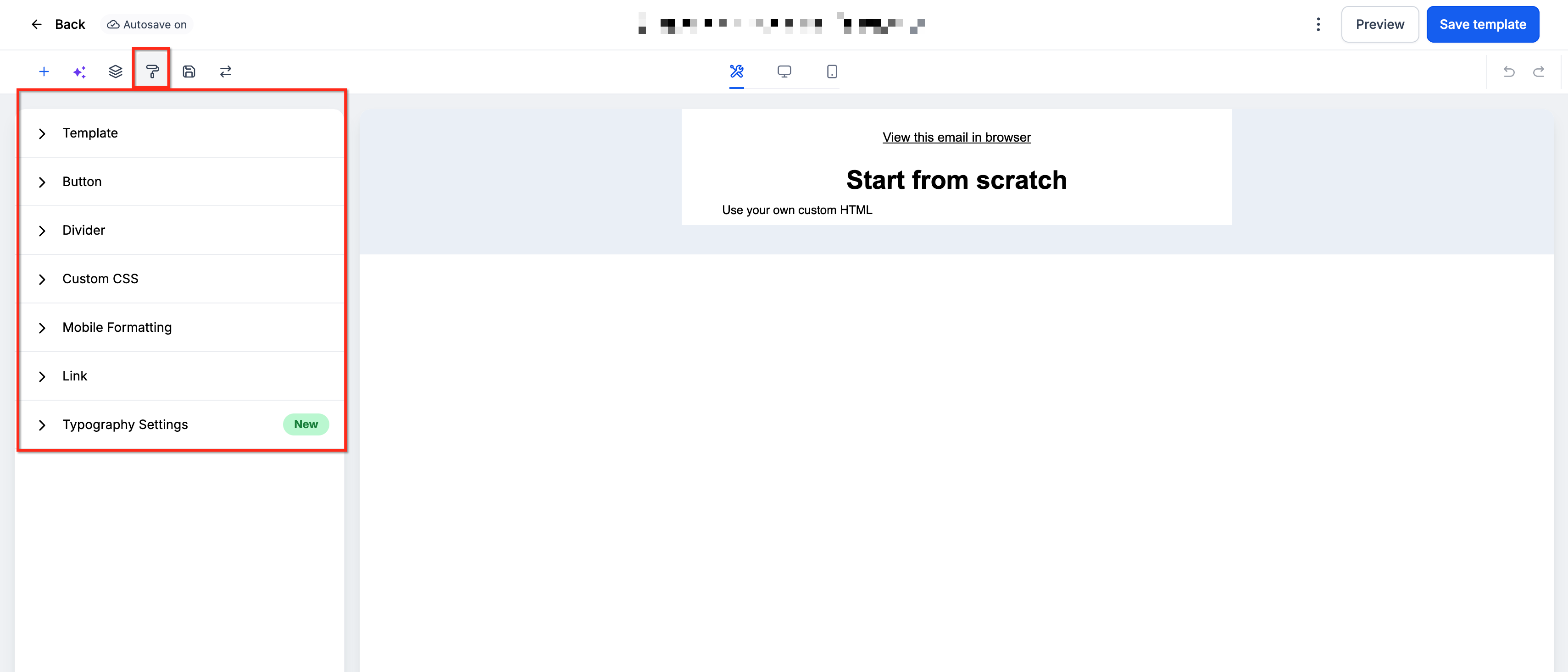
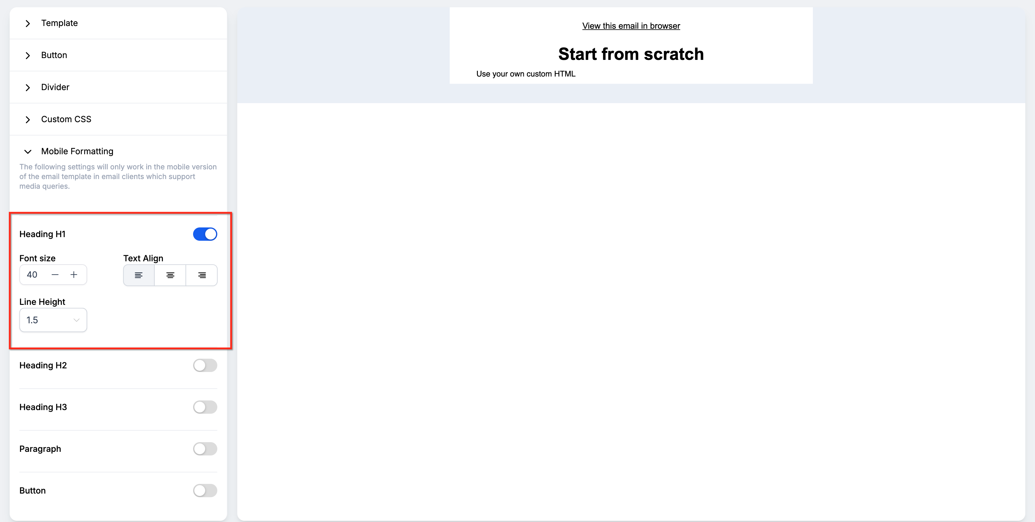
- In the builder, open the Appearance tab.
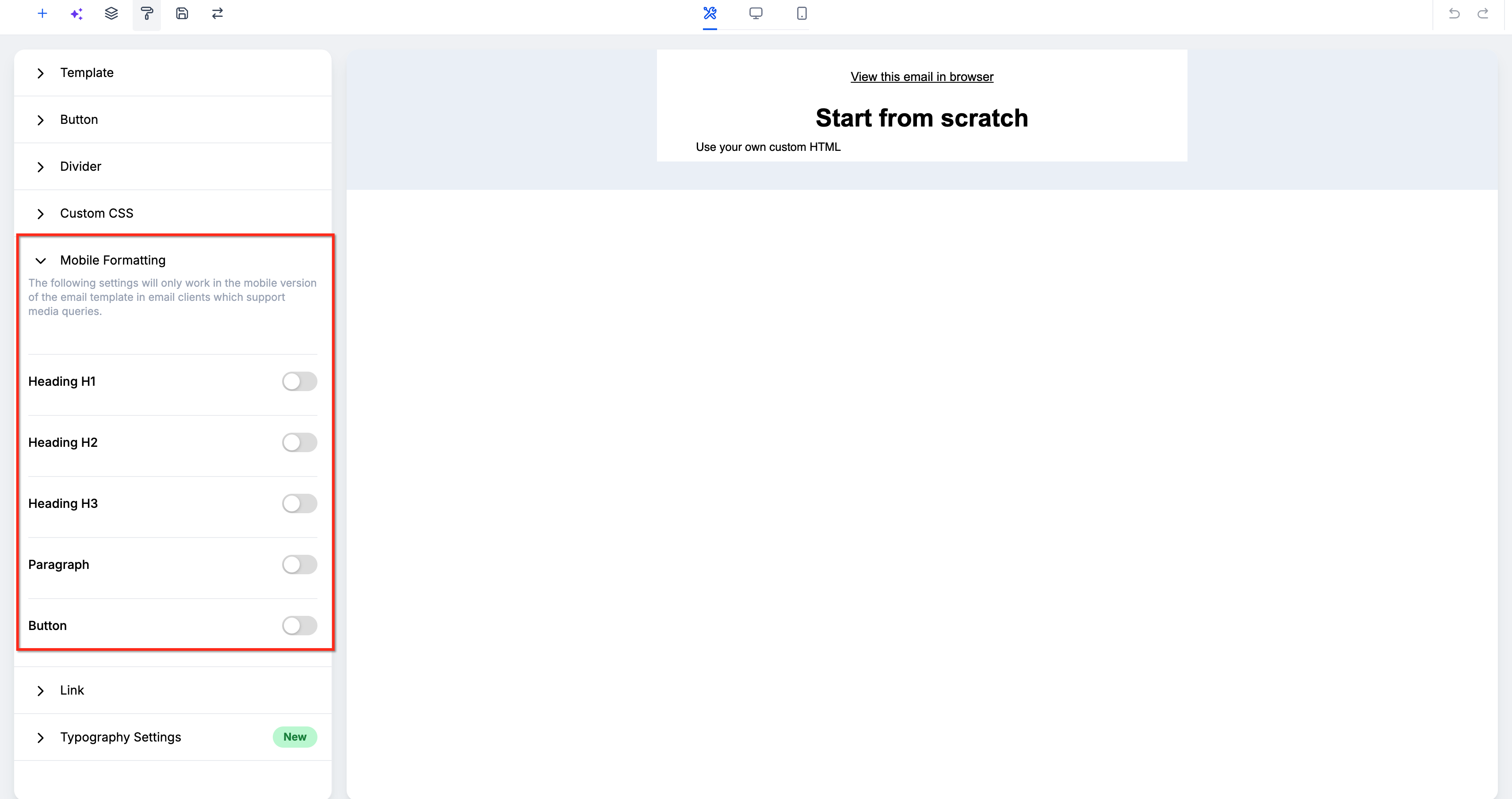
- Find the Mobile Formatting group.
- Enable the mobile override for the desired text settings.
- Change the mobile font size as needed.
- Adjust the line height for readability.
- Set the mobile text alignment.
- Open the mobile preview to review the result.
Adjust mobile padding and margins
- Select the section or element you want to modify.
- Open its Style settings.
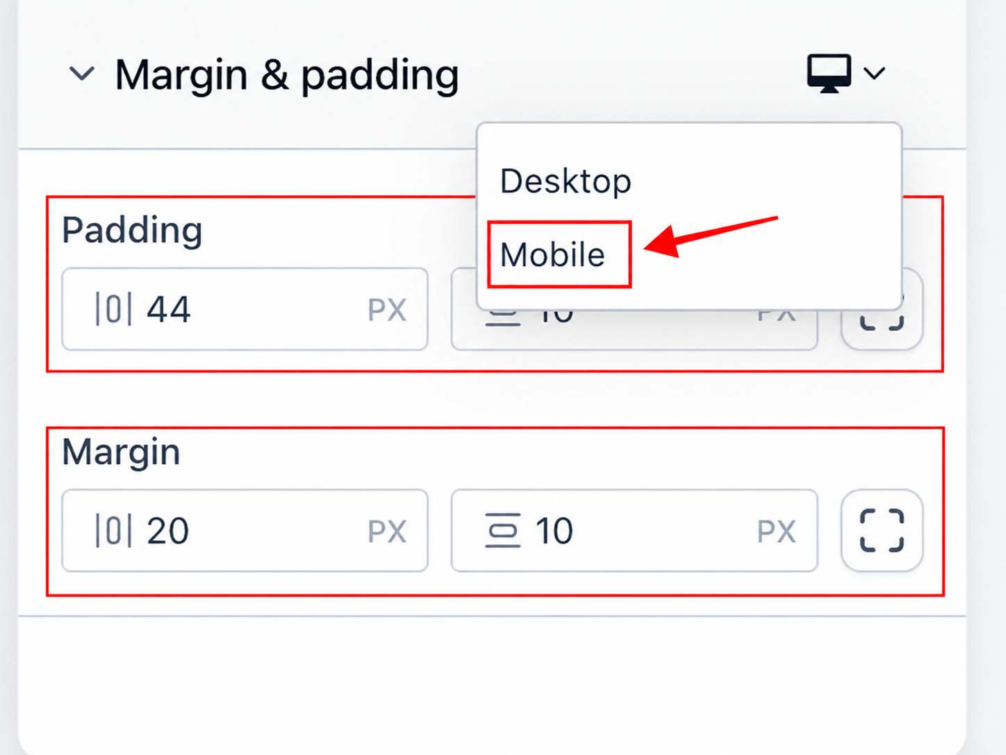
- Expand the Margin & Padding section.
- Choose Mobile from the device selector.
- Modify the mobile padding values.
- Modify the mobile margin values.
- Review the spacing in Mobile view.
- Switch back to Desktop to confirm desktop spacing remains unchanged.
Customize buttons for mobile
- Select the Button element in the email.
- Open the Style tab for the button.
- Expand the Alignment controls.
- Set the device selector to Mobile.
- Choose the desired mobile alignment option.
- Expand the Typography controls.
- Switch the device selector to Mobile.
- Adjust font family, size, weight, style, or decoration as needed.
- Modify any mobile specific spacing, padding, or full width option.
- Review the button in both Mobile and Desktop views.
Adjust images, logos, and videos
- Select an Image, Logo, or Video element.
- Open its styling settings panel.
- Choose Mobile from the device selector where available.
- Set the mobile alignment you prefer.
- Enter the mobile dimensions for the media.
- Adjust the mobile padding settings.
- Verify the media looks correct in Mobile and Desktop previews.
Customize social icons
- Select the Social element in the email.
- Open its styling settings.
- Select Mobile in the device selector.
- Set the mobile icon alignment.
- Change the mobile icon size.
- Adjust the spacing between icons for mobile.
- Check the Social element in both Mobile and Desktop views.
Save your changes
- Review the mobile design one final time.
- Switch to Desktop and confirm its layout is unchanged.
- Click the Save button in the editor.
- Proceed to preview or test the email before sending.
Preview the mobile version
- From your subaccount, open Marketing then Emails.
- Access the Templates or Campaigns list.
- Open the email in the Design Editor.
- Click the Preview icon at the top right.
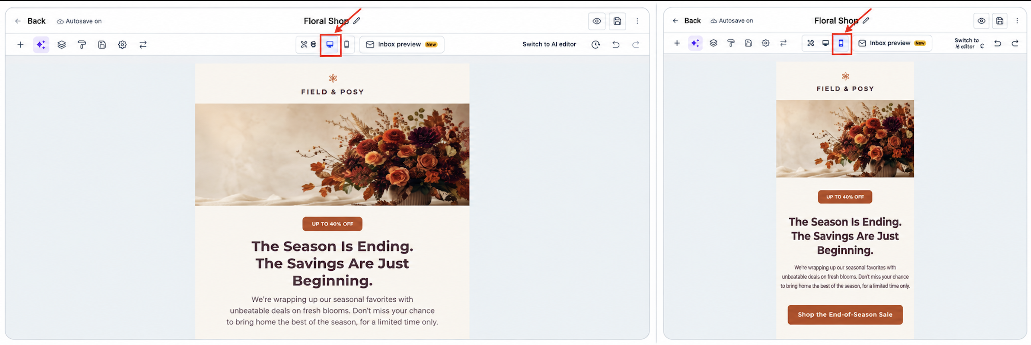
- Select Mobile from the preview device options.
- Examine spacing, text, buttons, images, videos, and icons.
- Switch to Desktop preview to compare.
- Note any issues that need adjustment.
Send a test email
- In the Design Editor, locate the Preview button.
- Click the three dot menu next to Preview.
- Choose Test Email from the dropdown.
- Fill in Sender Email, Sender Name, Receiver Email, Preview Text, and Subject fields.
- Press Send Test Email.
- Open the delivered message in a real inbox.
- Review how it appears on target devices and email clients.
06What it looks like in HighLevel
07Settings that matter
- Mobile Override Toggle. Enables a separate mobile value for a setting instead of inheriting the desktop value.
- Alignment. Controls the horizontal placement of an element on mobile devices.
- Full width behavior. Sets a button to stretch across the full width of the mobile screen.
- Spacing and padding. Adjusts the space around and inside an element for mobile layouts.
- Font size. Defines the size of text on mobile when the override is active.
- Font weight. Specifies the thickness of mobile text characters.
- Font style. Applies italic or normal styling to mobile text.
- Text decoration. Adds underline or other decorative styles to mobile text.
- Padding. Sets internal space of a section or element on mobile.
- Margin. Sets external space around a section or element on mobile.
- Icon alignment. Positions social icons horizontally on mobile.
- Icon size. Controls the visual size of each social icon on mobile.
08Things to know before you rely on it
- Mobile controls appear only on supported sections and elements; not every setting is available for every element.
- Overrides inherit desktop values until you enable and set a mobile specific value.
- Existing templates keep their current look until you modify mobile specific styling.
- Some email clients may ignore mobile overrides and display default styling.
- Device Visibility controls visibility separately from Mobile Formatting.
- Important: Do not rely on a mobile override to fix a critical layout problem that would make the email unusable if the receiving client ignores the override.
09If something goes wrong
- Mobile font size does not change. Make sure the mobile font size override toggle is enabled and that the receiving email client supports responsive CSS.
- Mobile changes affect the desktop version. Verify that you edited values under the Mobile tab; desktop settings remain unchanged when only mobile overrides are applied.
10How it connects to the rest of HighLevel
- Move the Email Builder edit panel Edit panel guide
- Set up and use the HighLevel template library Template library
- HighLevel pricing and plans Pricing
Michael's take

When a campaign gets many clicks from phones, I find that tweaking button size, spacing and font on mobile can improve the experience. The separate mobile overrides let you keep your desktop design untouched while ensuring tap targets are larger and text stays readable on small screens.
If your audience mainly opens emails on desktop or you’re sending a simple newsletter, the extra steps of turning on overrides and testing each client may not be worth the effort. In those cases the default responsive behavior already gives a decent experience without extra work.