
01Who this is for
- Marketing teams benefit because the feature enforces brand consistency across every client facing form.
- Web designers can rely on one setting to style all interactive elements, reducing the time spent on custom CSS.
02Primary color effects, explained
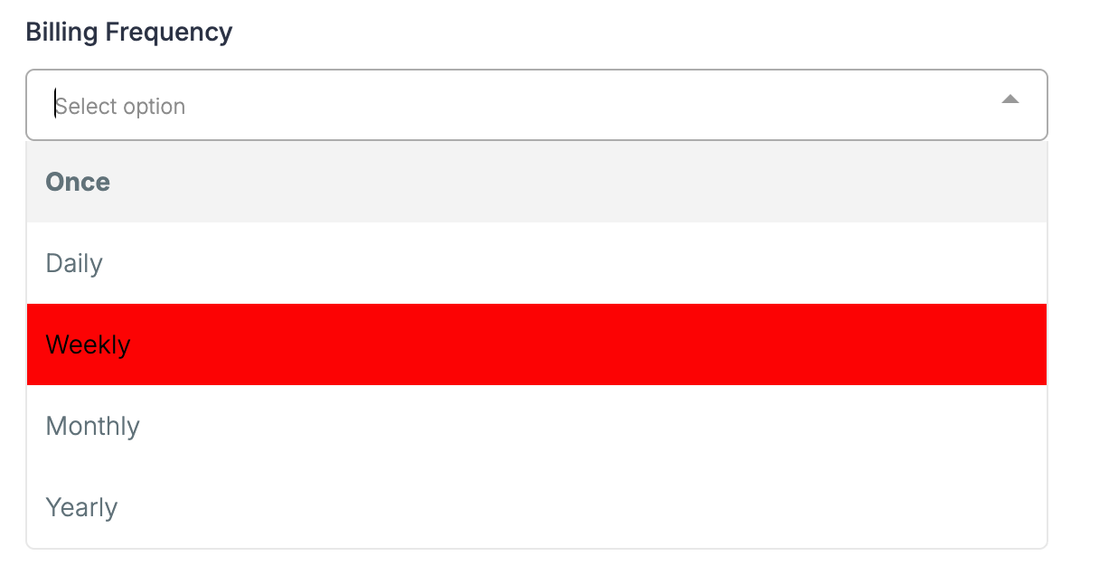
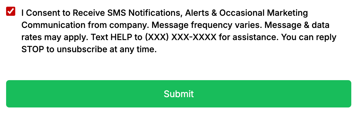
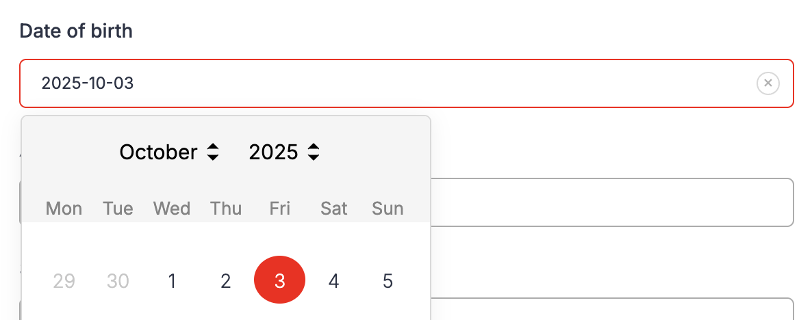
The Primary Color controls the visual feedback shown when a visitor interacts with a form field, dropdown, checkbox, radio button, date picker, file upload or signature area. When a user hovers over a field or clicks into it, the element’s border or fill changes to the selected brand color. The same color appears for selected checkboxes, active dates and opened dropdown menus.
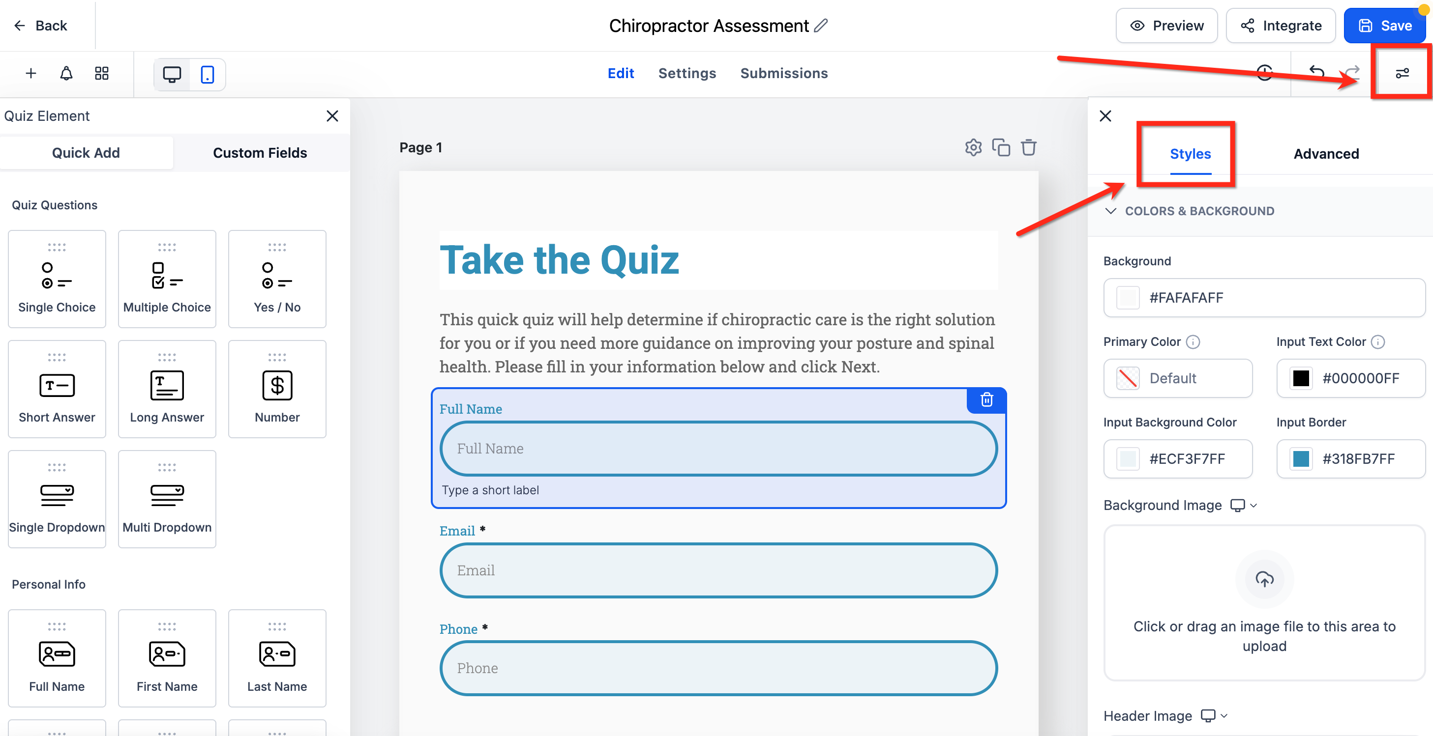
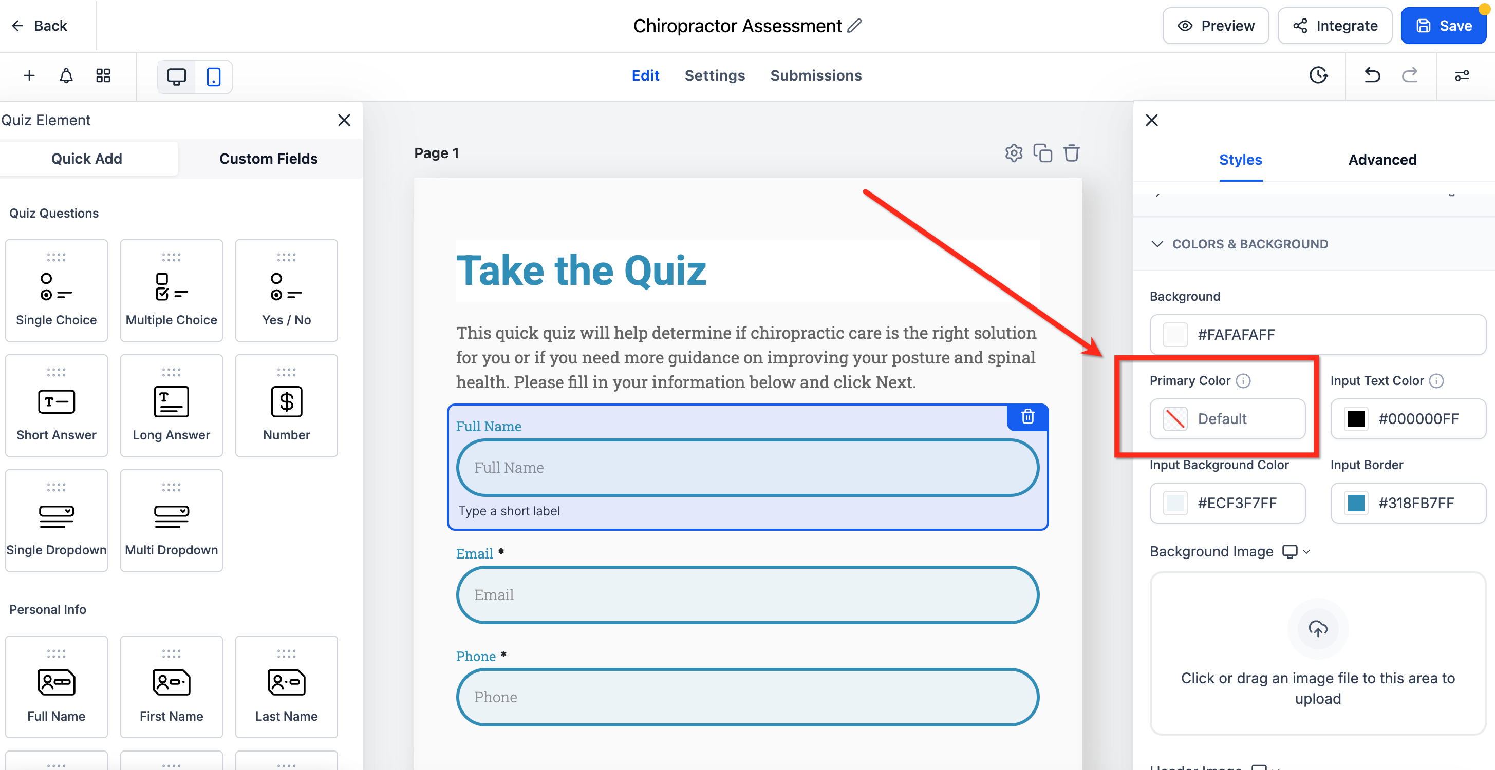
The setting lives inside the form builder under the Style and Options section. It appears in the Styles tab, within the Colors and Background group. Changing the value updates every form that uses the default styling across the account. An optional toggle can also force buttons to inherit the same hue, creating a fully unified look.
03How businesses use primary color effects
- Real estate agency. The agency picks its signature teal as the Primary Color, so every lead capture form highlights fields in that shade. By turning on the button mapping, the submit button matches the same color, giving a cohesive appearance without extra design work.
- Fitness studio. The studio selects a bright orange for the Primary Color to make input borders pop on class sign up surveys. Hover and focus cues become right away visible for members using mobile devices.
- Legal consultancy. The consultancy sets a deep navy as the Primary Color, ensuring that all client intake forms display consistent interactive styling, which reinforces professionalism and aids accessibility.
04How to set up and use primary color effects in HighLevel
Change primary color for all forms, surveys and quizzes
- Open the form builder and choose Style and Options > Styles.
- Scroll to the Colors and Background area and locate the Primary Color field.
- Pick a color from the palette or type a custom hex code.
- If you want buttons to share the same hue, turn on the Map Primary color to Button color toggle.
- Click Save so the new color applies to every interactive element.
05What it looks like in HighLevel

06Settings that matter
- Primary Color. Defines the brand hue applied to hover, focus and selection states for all form components.
- Map Primary color to Button color. When enabled, button backgrounds adopt the same Primary Color, creating a uniform visual theme.
07Things to know before you rely on it
- The color setting affects every form that uses the default styling; individual forms cannot have separate primary colors.
- Hover and focus highlights are always active; they cannot be disabled.
- The same visual effects appear on mobile browsers as on desktop.
- If no primary color is set, forms revert to the platform’s neutral styling.
08How it connects to the rest of HighLevel
- Create and manage contact forms with the HighLevel form builder. Contact form builder
- Add sticky contact options to your forms, surveys and calendars. Sticky contact
- Embed HighLevel forms on external website platforms. Embedding forms
Michael's take

Your forms need to feel like a natural extension of your brand, otherwise visitors can feel disconnected and hesitant to complete them. The primary color effect solves that by automatically highlighting fields, dropdowns, and buttons with your brand hue, making the experience feel cohesive and clear.
The first setting to nail down is the Primary Color itself. Pick the exact hex that matches your brand palette and decide whether buttons should follow that same color. Once that’s set, every form interaction will automatically reflect your brand without any extra design work.