
01Who this is for
- Marketing managers can tailor form appearance for mobile users without altering desktop designs.
- Small business owners can keep survey branding consistent across devices while optimizing for small screens.
02Mobile Editor, explained
The Mobile Editor adds a dedicated set of controls that appear when you toggle to Mobile View in the Forms, Surveys, or Quizzes builder. These controls let you choose a layout style, upload header and background images that are used only on mobile, and adjust typography for individual text elements.
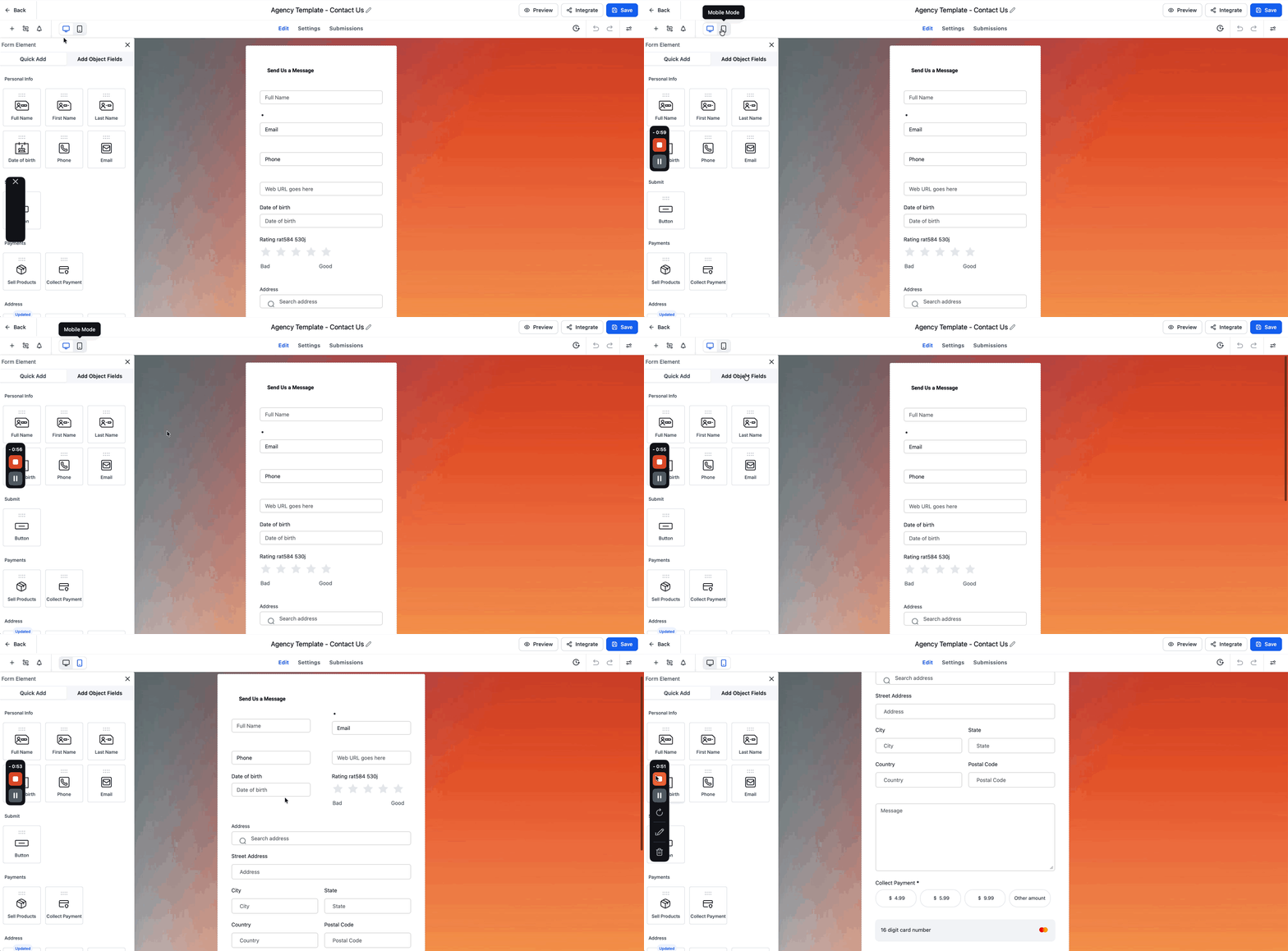
The editor lives inside the same builder interface. Switching to Mobile View reveals a right hand panel with mobile only settings. Changes you make apply solely to the mobile version; desktop styling remains unchanged. You can preview the mobile design before saving and publishing the form.
03How businesses use mobile editor
- Real estate agency. Upload portrait style header images for property inquiry forms and increase label font size in Mobile View, then preview to ensure mobile prospects can complete the form easily.
- Fitness studio. Adjust placeholder text and font weight on class sign up quizzes within Mobile View, use the preview button, and publish the mobile optimized quiz for members.
- Online education platform. Create a separate mobile background image for course enrollment surveys and set short label fonts, allowing mobile learners to navigate the survey smoothly.
04The numbers and rules that matter
- The Mobile Editor is included in all plans that offer Forms, Surveys, or Quizzes.
05How to set up and use mobile editor in HighLevel
activate and configure mobile editor
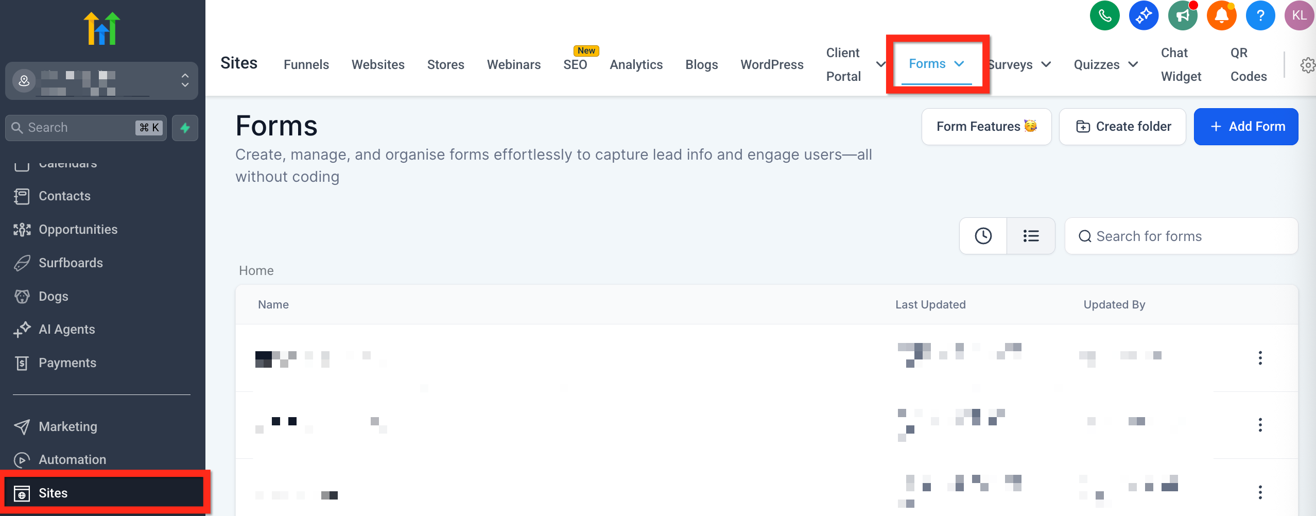
- Open the desired form, survey, or quiz from the builder dashboard.
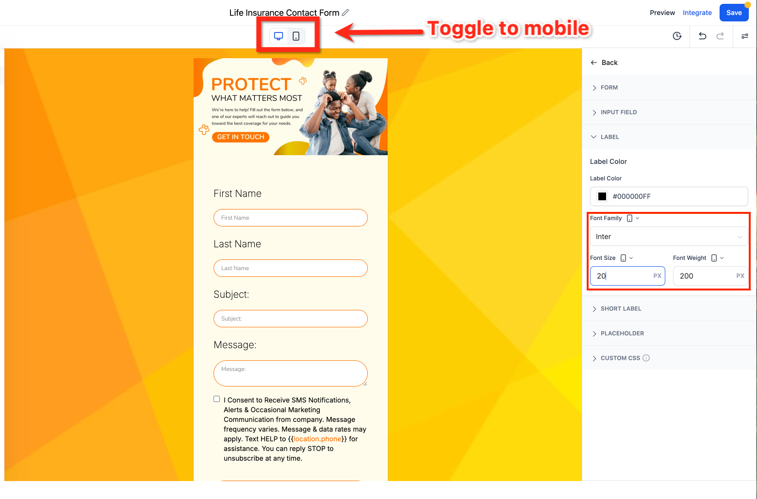
- Click the Device Toggle at the top of the screen to switch to Mobile View.
- Choose a Layout Style from the mobile settings panel.
- Upload a Mobile Header Image using the Mobile Header Image option.
- Upload a Mobile Background Image using the Mobile Background Image option.
- Set the font family, size, and weight for Labels, Short Labels, and Placeholders.
- Click Save to store your changes.
- Click Preview while still in Mobile View to test how the form looks on a mobile device.
- When you are satisfied, click Publish so the mobile optimized version goes live.
06What it looks like in HighLevel
07Settings that matter
- Layout Style. Controls the overall arrangement of form elements when viewed on a mobile device.
- Mobile Header Image. Specifies the image shown at the top of the form in Mobile View only.
- Mobile Background Image. Provides a background picture that appears solely on the mobile version of the form.
- Font Family. Chooses the typeface applied to mobile text elements.
- Font Size. Sets the pixel size of text for readability on mobile screens.
- Font Weight. Defines the thickness of mobile text such as bold or light.
08Things to know before you rely on it
- Mobile style settings do not overwrite desktop styles; each device keeps its own properties.
- You can set top and bottom padding to 0 px for true zero spacing on mobile without affecting desktop padding.
- Reset or Copy from Desktop may be available, but its presence needs confirmation.
- The Mobile Editor is included in all plans that provide Forms, Surveys, or Quizzes.
09How it connects to the rest of HighLevel
- Contact form builder guide Contact form builder
- Sticky contact feature Sticky contact
- Pricing and plans Pricing
Michael's take

When many of your leads come from phones, the Mobile Editor lets you tailor images and fonts specifically for mobile devices, keeping the experience on brand.
If most of your audience fills forms on a desktop, you may decide to keep a single design that works across devices and only add mobile styling if you notice a need.