
01Who this is for
- Founders who design funnels need precise visual checks before publishing.
- Marketing agencies can verify client pages look correct on varied screen sizes.
- Web designers working on responsive templates benefit from testing exact widths.
02Device width previews, explained
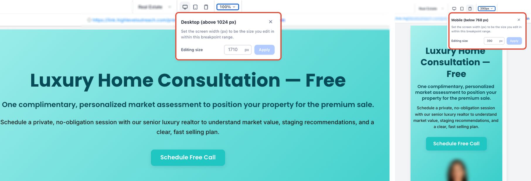
Device Width Preview adds a numeric input next to the device selector in the builder. After choosing a breakpoint, Desktop, Tablet, or Mobile, you type a pixel value within the supported range and the canvas resizes to that width. The change only affects the preview; it does not create a new breakpoint, alter saved styles, or modify the live page.
The feature lives inside the Funnel and Website Builder. It resets when the builder is reloaded or when you navigate away, and the entered width is not stored in page data. The preview can be reset to the default width for the active breakpoint at any time.
03How businesses use device width preview
- Digital marketing agency. The agency opens a client’s funnel page, selects Tablet mode, enters 900 px, and reviews column spacing. They repeat with other widths to ensure the design adapts before delivering the funnel.
- SaaS startup. The startup’s Founder edits a website landing page, switches to Desktop mode, inputs 1400 px, and checks that hero images stay centered across large screens, then resets the preview.
- Local service business. A local plumber uses the builder to open a service page, chooses Mobile mode, types 375 px, and scrolls horizontally to verify button placement on narrow screens.
04The numbers and rules that matter
- Desktop supported width: 1025, 3000 px.
- Tablet supported width: 768, 1024 px.
- Mobile supported width: 320, 767 px.
05Before you start
- A page must be opened in the Funnel or Website Builder.
06How to set up and use device width preview in HighLevel
Preview device width in the builder
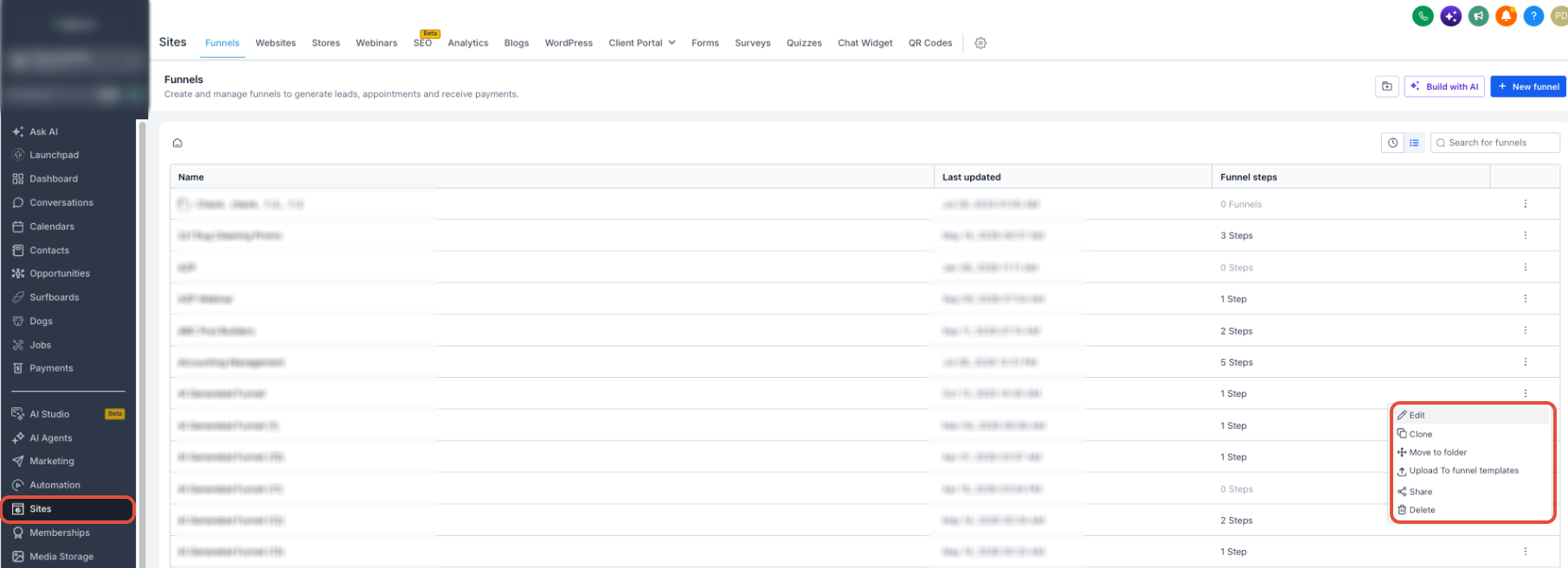
- In Subaccount View, click Sites in the left navigation.
- Choose Funnels or Websites from the submenu.
- Select the specific funnel or website to edit.
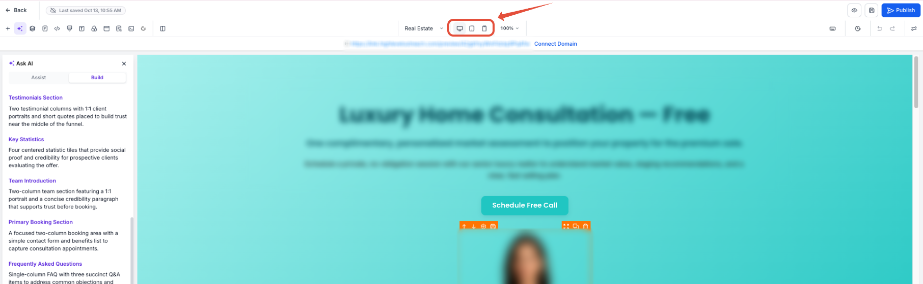
- Open the desired step or page inside the builder.
- Click the device switcher and pick Desktop, Tablet, or Mobile.
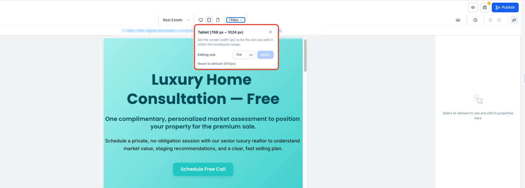
- Find the Device Width field next to the switcher.
- Type a pixel value that falls within the allowed range for the chosen mode.
- If the value is outside the supported range, the builder shows inline validation feedback and you must enter a valid width.
- Press the Apply button or hit Enter to update the canvas width.
- Scroll horizontally if the preview exceeds the workspace.
- To return to the default width, use the reset option; this does not change any saved responsive styles.
Adjust row and column widths for Desktop and Tablet
- Open the funnel or website page in the builder.
- Use the device switcher to select Desktop view.
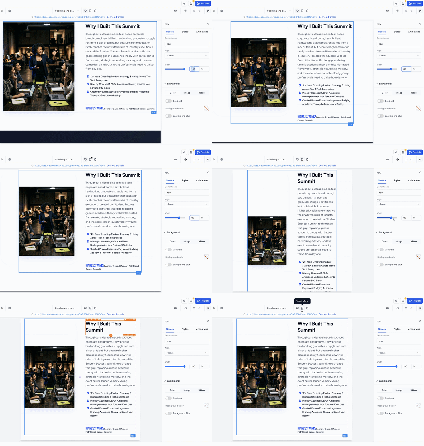
- Select a row and change its Width setting.
- Switch to Tablet view and drag the handle between columns to resize them.
- Toggle between Desktop and Tablet views to compare layouts.
- Save the changes to retain the new widths.
07What it looks like in HighLevel
08Settings that matter
- Device Width. Controls the exact pixel width of the builder canvas for the active device mode.
- Width. Sets the width of a selected row or column in Desktop or Tablet view.
09Things to know before you rely on it
- Supported preview widths are 1025 to 3000 px for Desktop, 768 to 1024 px for Tablet, and 320 to 767 px for Mobile.
- Entered widths are only valid for the current builder session and reset on reload or navigation.
- Preview changes do not affect published pages or generate new responsive breakpoints.
- Tablet inherits Desktop row and column widths until they are customized; mobile rows are always full width and the width control is hidden.
10If something goes wrong
- Entered width is outside the supported range. Enter a pixel value that falls within the range for the selected device mode.
- Canvas is wider than the builder workspace. Scroll horizontally to view the entire preview area.
11How it connects to the rest of HighLevel
- Review mobile settings and domain connection for websites Website overview
- Add tracking code to funnels and websites Add tracking code
- Set up a root domain or subdomain for funnels and websites Domain setup
Michael's take

When a page looks great on a full screen desktop but breaks on a smaller tablet, you need a way to see exactly where the layout shifts. Device width preview lets you type any pixel value within the breakpoint range, so you can spot those gaps before the page goes live.
The first setting I would get right is the device mode, Desktop, Tablet or Mobile. Because that determines which responsive styles you are editing. Once the mode is set, I would enter a few key widths to confirm rows and columns stay aligned.