
01Who this is for
- Ecommerce store owners, need responsive product images that look good on phones and computers.
- Coaches and consultants, want their portrait or logo images to scale correctly across devices.
- Agency designers, require precise control over image sizing for client websites and funnels.
02Image dimensions settings, explained
Image dimension settings give you separate height and width controls for the mobile and desktop versions of a page. In the builder you can pick pixels for fixed sizes, rem or em for font relative scaling, or percentages that follow the container width. The controls apply only to the image you edit and do not alter other assets.
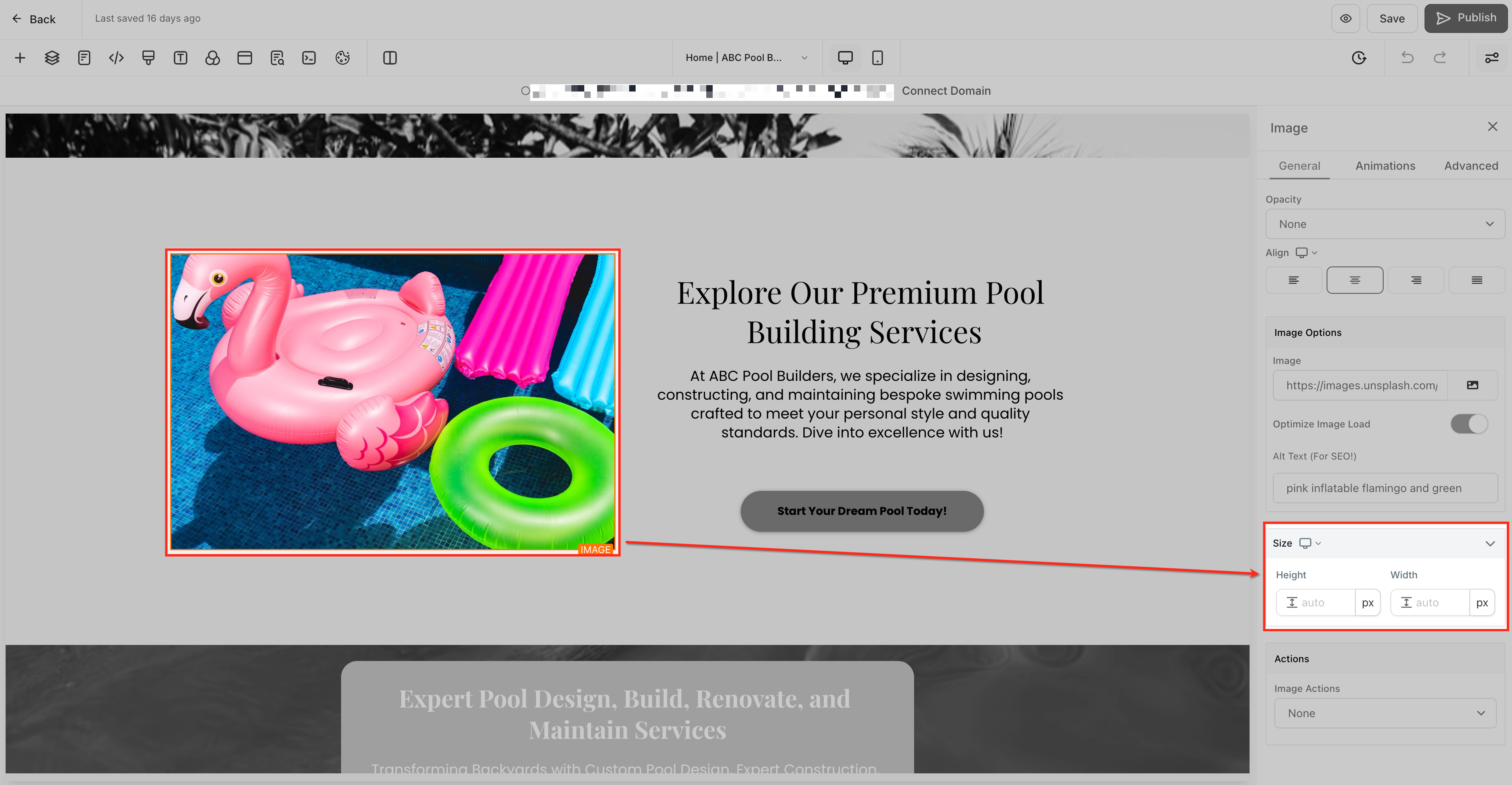
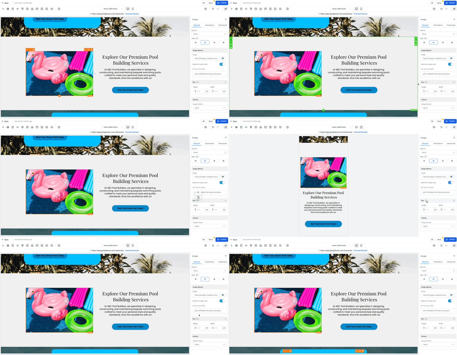
The feature lives inside any Funnel or Website Builder page that contains an image. Open the page, select the image, and the settings panel shows Height, Width, and a unit selector. Use the preview toggle at the top to switch between mobile and desktop views, then enter values for each view. Save and preview to confirm the image appears as intended on all devices.
03How businesses use image dimensions settings
- Ecommerce store. Select a product photo, switch to mobile view, set a smaller height in pixels, then return to desktop view and assign a larger width in percentages. Save and preview to verify the photo fits both screen sizes.
- Online coach. Open the landing page, click the coach's portrait, choose rem units for height to keep the image proportional to surrounding text, and set the width to 100% for full width display on desktop. Save the changes.
- Digital agency. Within a client’s funnel, edit a banner image, use the desktop view to set a width of 1200px, then switch to mobile view and set the width to 90%. Select em for the height to match the client’s typography scale. Save and preview both versions.
04The numbers and rules that matter
- Units: Px, rem, em, %.
05Before you start
- Access to the Funnel or Website Builder in the HighLevel dashboard.
06How to set up and use image dimensions settings in HighLevel
Adjust image dimensions for mobile and desktop
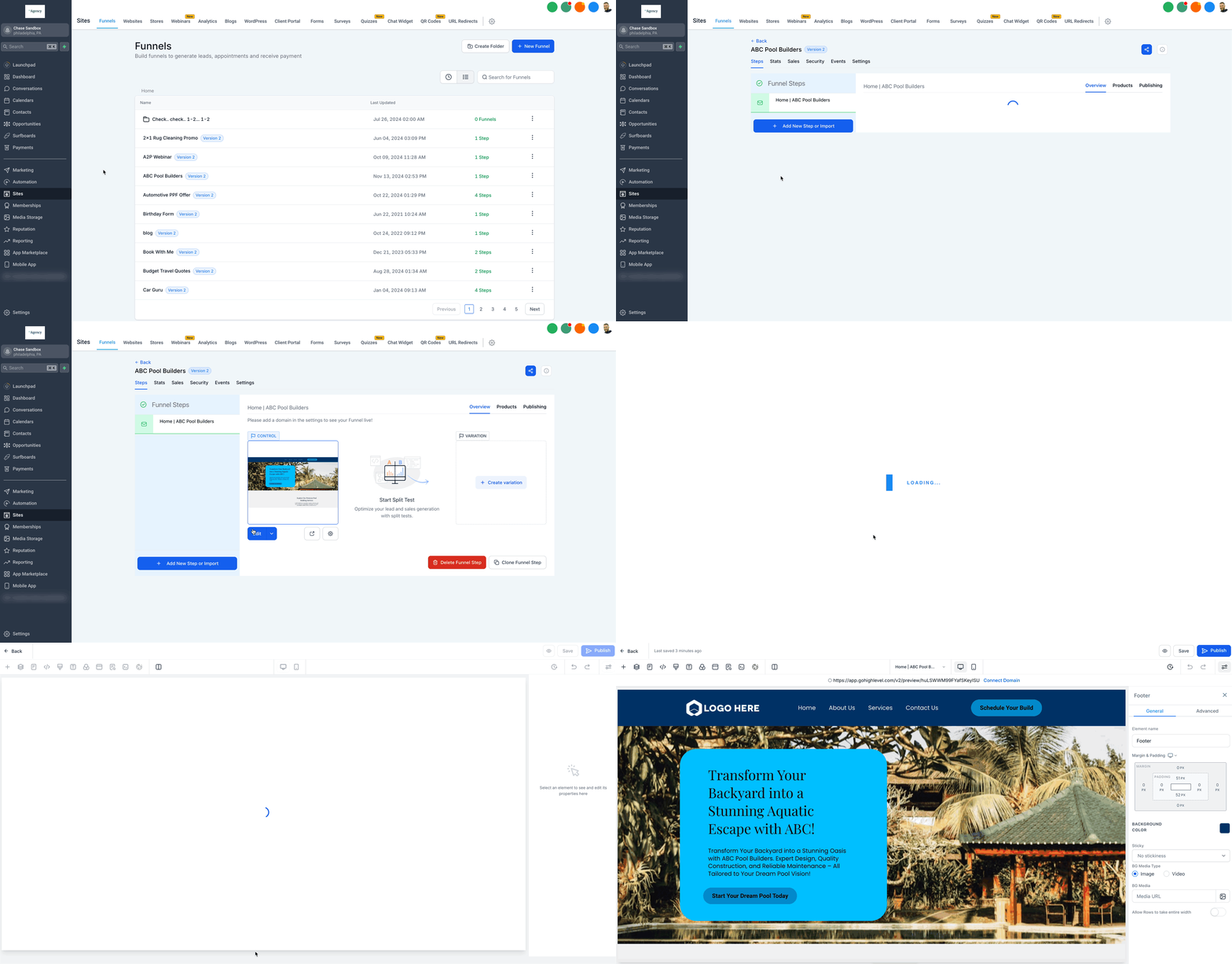
- Navigate to the Funnel or Website Builder from the HighLevel dashboard.
- Select the page that contains the image you want to modify.
- Click the image to open its settings panel.
- Use the preview toggle to switch to Mobile view or Desktop view.
- Locate the Height field and enter the desired value.
- Locate the Width field and enter the desired value.
- Choose the unit of measurement (px, rem/em, or %).
- Save the changes and preview the page in both mobile and desktop views.
- Remember that changes made in mobile view affect only mobile, and changes made in desktop view affect only desktop.
07What it looks like in HighLevel
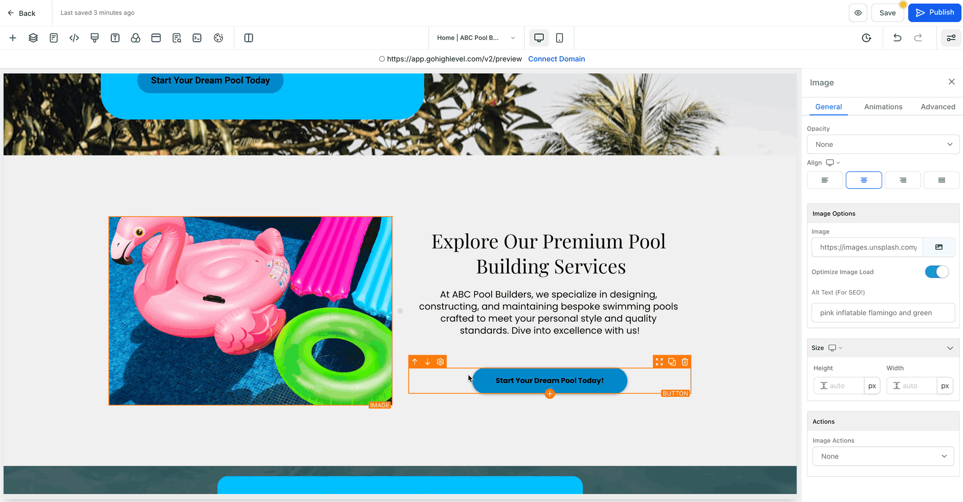
08Settings that matter
- Height. Controls the vertical size of the selected image for the active view.
- Width. Controls the horizontal size of the selected image for the active view.
- Unit of measurement. Determines whether the dimension values are interpreted as pixels, relative font units (rem/em), or percentages of the container.
09Things to know before you rely on it
- If mobile dimensions are not set, the image will fall back to the desktop dimensions.
- Existing images keep their current sizes until you modify them individually.
- The feature is available to all HighLevel accounts that can access the Funnel or Website Builder.
10How it connects to the rest of HighLevel
- Review mobile settings when building a website website overview
- Add tracking code to funnels and websites tracking code
- Set up a root domain or subdomain for funnels and websites domain connect
Michael's take

A small convenience that can feel like a real shift for sites that look clunky on phones. Being able to tell an image to stay tall on desktop but shrink on mobile saves you from redesigning whole sections just to fix a single visual hiccup.
A boutique clothing shop that showcases runway looks fits perfectly. The shop can keep large hero images crisp on a laptop while scaling them down for shoppers browsing on a phone, keeping the look polished without extra load time.