
01Who this is for
- Digital marketers who design multiple funnels benefit from faster access to style and animation controls.
- Coaches building webinar landing pages gain a cleaner workspace by collapsing rarely used panels.
- Ecommerce owners can quickly adjust button actions and hover effects without navigating away from the builder.
02Revamped sidebar, explained
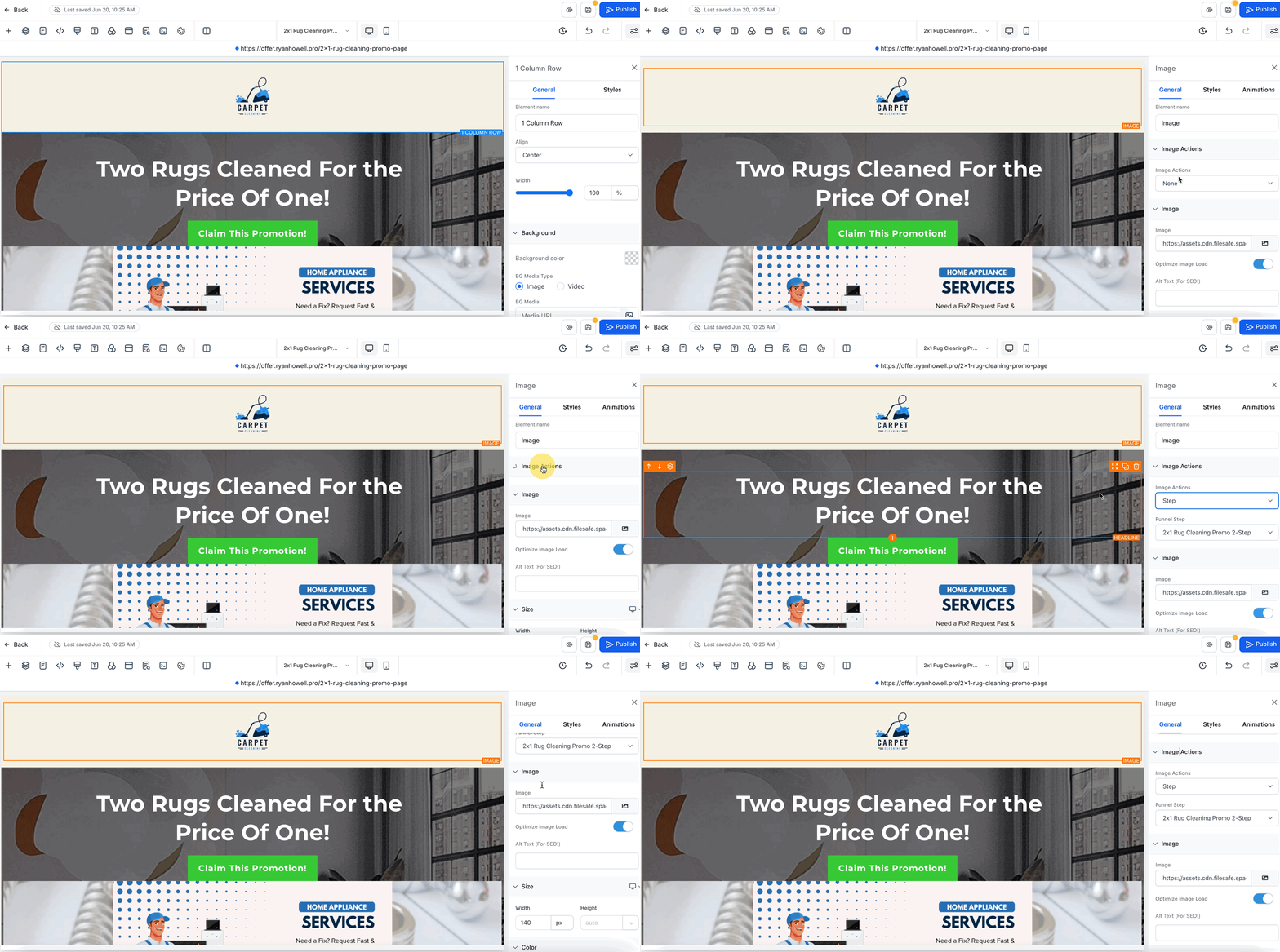
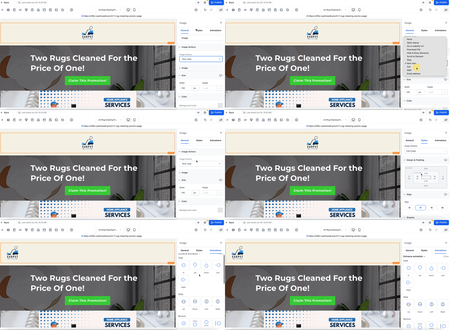
The new sidebar lives on the right side of the Funnel & Website Builder. It replaces the previous single panel layout with three tabs, General, Styles, and Animations, so each category of settings appears only when needed.
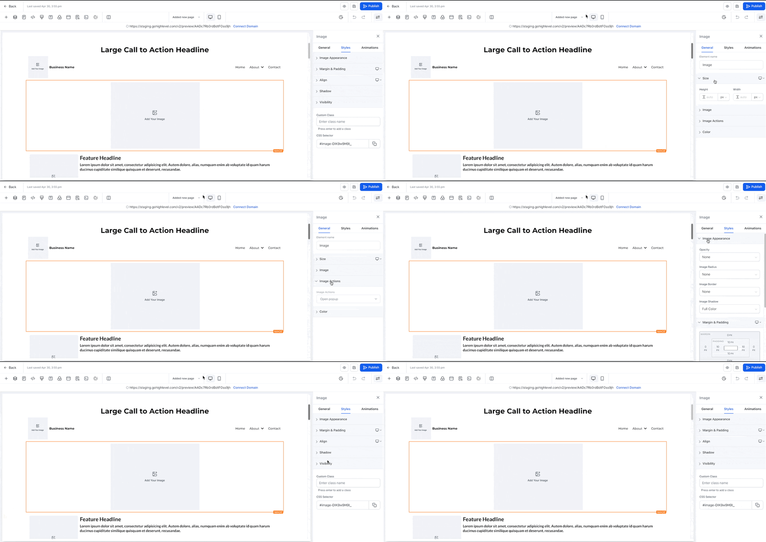
Each tab contains related options inside collapsible panels. Panels keep the state you set (open or closed) while you edit other elements, and the last used tab remains selected when you switch between elements. When a new element is added, all panels open by default for quick access.
03How businesses use revamped sidebar
- Digital marketing agency. Select a headline element, open the General tab, and rename the Element Name for clearer layer organization. Use the Typography controls to set font size and opacity, then switch to the Styles tab to adjust margin and padding for responsive alignment.
- Ecommerce store. Choose a button element, go to the Animations tab, and apply a Hover Animation. Adjust the Duration and Easing to define how the button reacts when a visitor hovers over it, then save the changes.
- Coaching business. Pick an image element, open the Styles tab, and set Border width, style, and corner radius. Use the Visibility panel to hide the image on mobile devices while keeping it visible on desktop.
04How to set up and use revamped sidebar in HighLevel
Edit an element using the revamped sidebar
- Open the Funnel or Website Builder and click the element you want to modify.
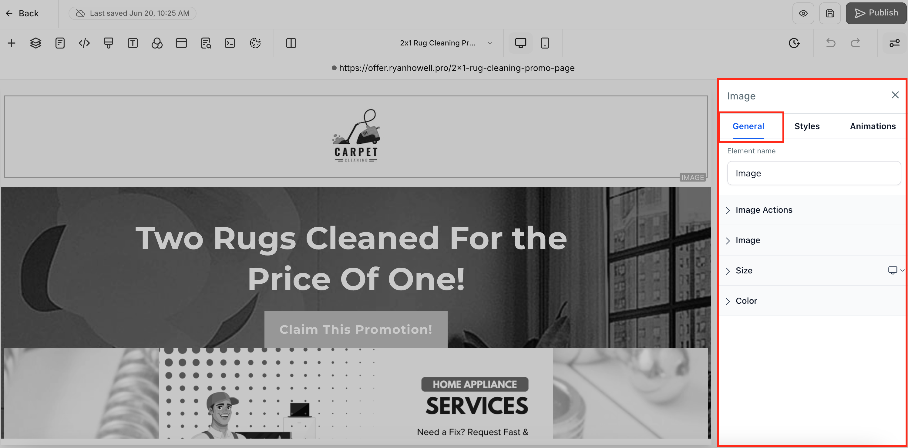
- In the right hand sidebar, select the General tab to edit content, typography, or color settings.
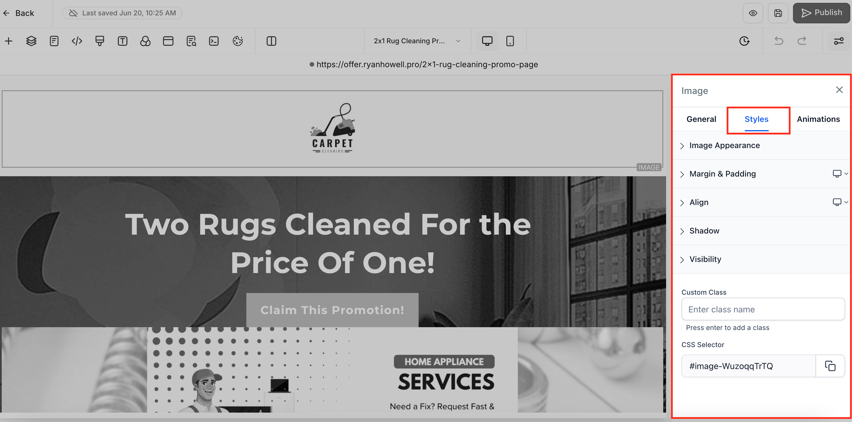
- Switch to the Styles tab to adjust margin, padding, border, alignment, visibility, text shadow, or custom class fields.
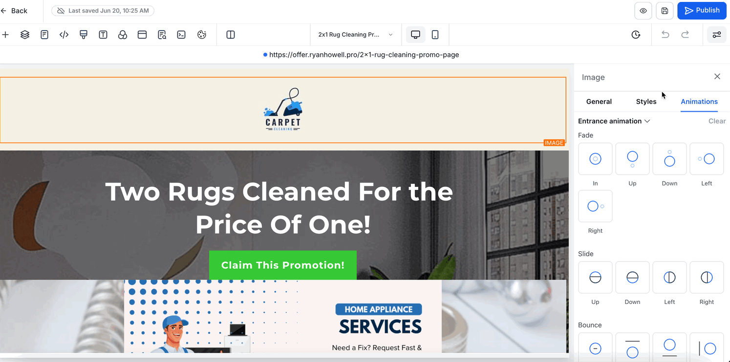
- If the element supports motion, move to the Animations tab to add entrance, infinite loop, or hover animations.
- Open or close any panel you need; the panel’s open/closed state will stay the same as you continue editing.
- Note that the controls shown in the Animations tab depend on the selected element.
- When adding a new element, all panels start expanded to give immediate access.
- The last tab you used stays active when you select another element, preserving your workflow.
05What it looks like in HighLevel
06Settings that matter
- Element Name. Renames the selected layer for easier identification in the builder.
- Element Options. Provides fields specific to the element type, such as text, URLs, alt text, or form labels.
- Element Actions. Defines interactive behavior like On click, Navigate to URL, Submit form, or Open lightbox.
- Typography. Controls font family, size, weight, line height, letter spacing, text transform, opacity, rotation and skew.
- Color Controls. Sets background, text, link, and icon colors using a picker or custom hex value.
- Margin. Adjusts the outer spacing of the element relative to surrounding objects.
- Padding. Adjusts the inner spacing between the element’s content and its border.
- Border. Sets width, style (solid, dashed, dotted), corner radius, and color for the element’s outline.
- Align options. Aligns text or objects left, center, right, or justify within the element.
- Visibility. Shows or hides the element independently on desktop, tablet, or mobile breakpoints.
- Text Shadow. Adds a drop shadow to text by defining horizontal and vertical offsets, blur radius, and color.
- Custom Class. Assigns a CSS class name for custom styling or scripting.
07Things to know before you rely on it
- Animation controls appear only for elements that support them; for example, Hover Animation is available on Buttons but not on all elements.
- The sidebar redesign only changes the editor interface; existing funnel and website designs remain unchanged.
- When a new element is added, all panels open by default to give immediate access to its settings.
08How it connects to the rest of HighLevel
- Explore all site building features in HighLevel. All Sites features
- Review HighLevel pricing and plan options. HighLevel pricing and plans
- Start a free trial to test the new builder UI. Start a 30 day HighLevel trial
Michael's take

The revamped sidebar feels like a small convenience that quickly becomes a real shift in how you build funnels. By clustering related controls and remembering where you left off, it cuts the back and forth clicking that slows down most creators.
A boutique ecommerce shop designing product landing pages will love the clear separation of content, styling and motion. The ability to hide the panels you don’t need lets you stay focused on the visual details that matter most.