
01Who this is for
- Marketing managers can draw attention to key calls to action by animating buttons, increasing visual interest.
- Web designers building client sites can showcase their style with entrance animations on images and sections.
- Small business owners can make their product pages feel more engaging by adding simple hover effects to purchase buttons.
02Dynamic visual effects, explained
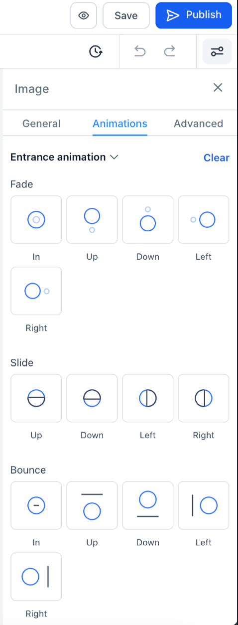
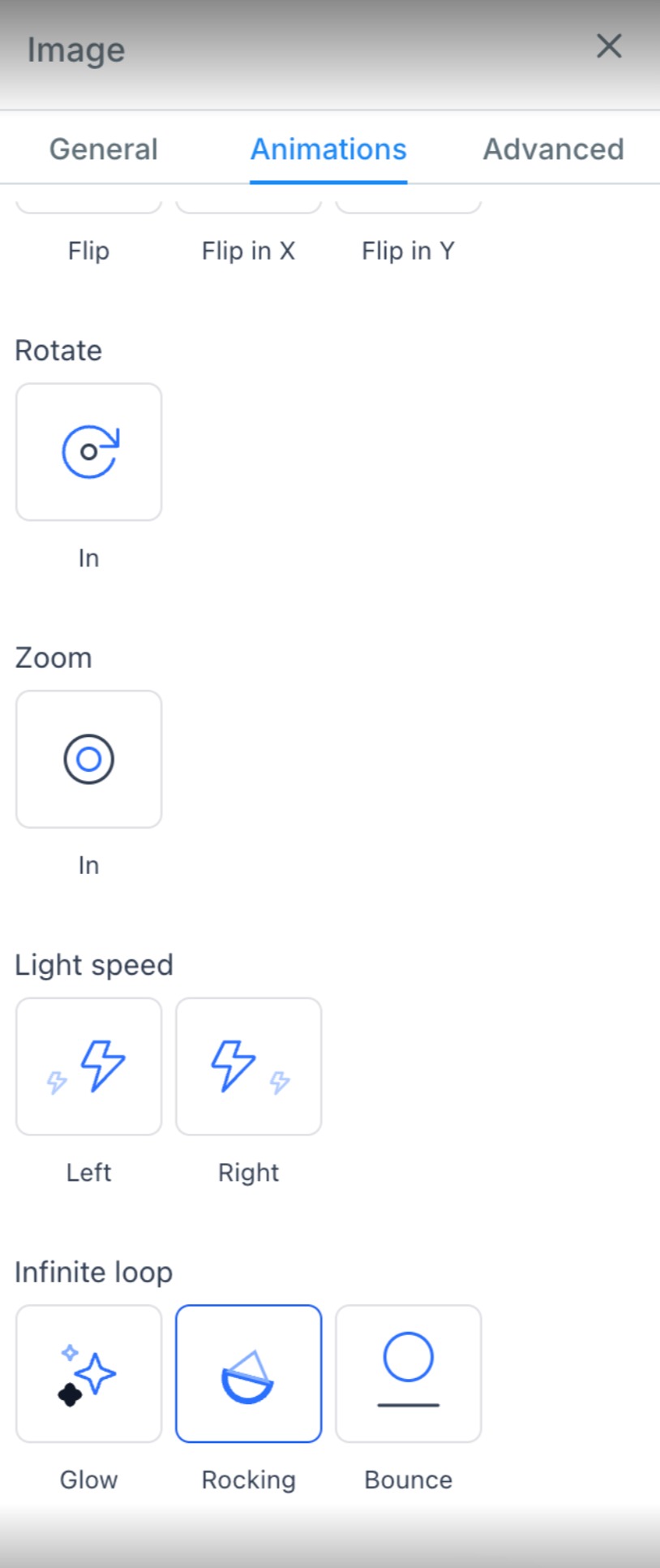
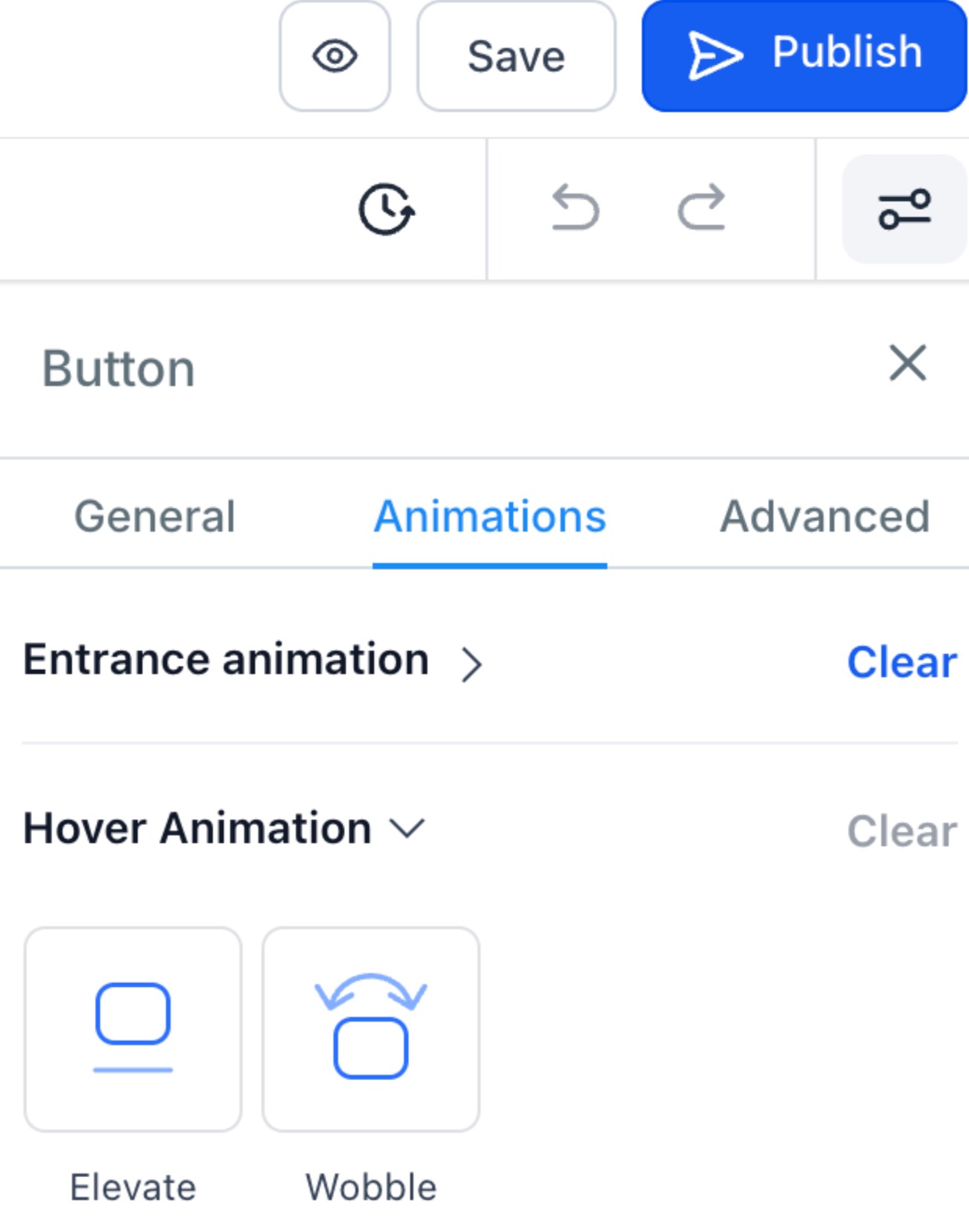
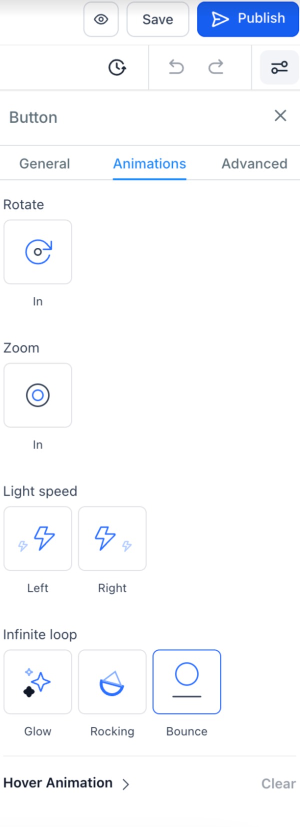
The platform offers a range of entrance animations such as fade, slide, bounce, rotate and zoom. These animations trigger when the element becomes visible on the page. Hover animations are available for buttons and include controls for timing and effect specific properties.
All animation options are accessed from the Animations tab in the sidebar of the funnel or website builder. Hover effects are automatically disabled on touch devices and on screens narrower than 1024 px. Loop animations can be applied for continuous motion.
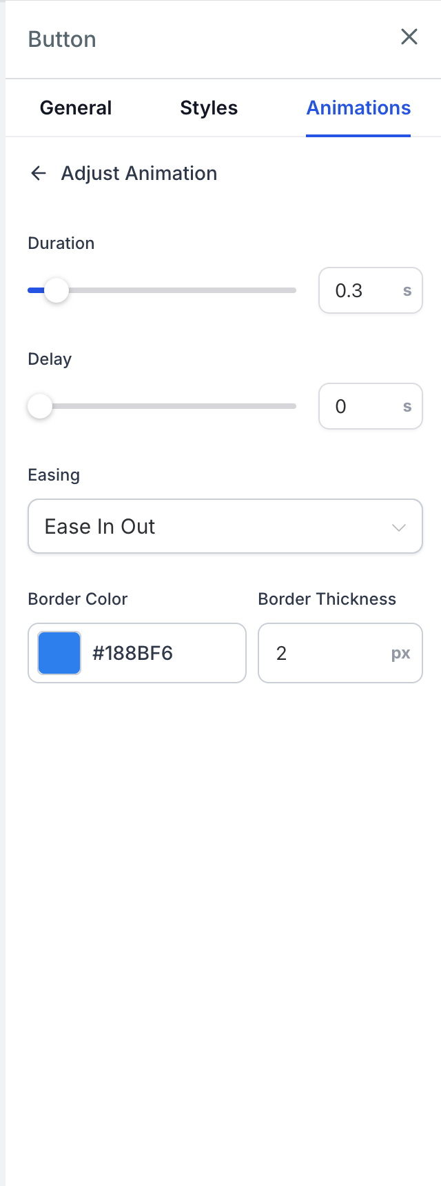
Button hover settings are now located in the Animations tab, keeping previous configurations intact. Users can preview each effect on the canvas and adjust duration, delay, easing, and any additional properties that the selected effect supports.
03How businesses use dynamic visual effects
- Online retailer. Select product image elements and apply a slide entrance animation to catch shoppers' eyes as they scroll. Then choose a hover animation for the "Add to Cart" button, adjusting the duration to create a subtle bounce when the cursor hovers.
- Fitness coach. Add a fade entrance effect to testimonial photos to introduce them gradually. For the "Book a Session" button, pick a hover animation and set a scale adjustment so the button enlarges slightly on hover, drawing attention to the booking link.
- Consulting firm. Apply a rotate entrance animation to service icons so they spin into view. Customize the hover animation on the "Contact Us" button by selecting a color change effect and modifying the fill color to match the brand palette.
04The numbers and rules that matter
- Supported hover effects include Duration, Delay, and Easing controls.
- Additional settings can include Scale, Angle, Distance, Fill Color, Border Color, Border Thickness, Blur, or Spread.
- Button hover animations are automatically disabled on touch devices and screens under 1024px.
05How to set up and use dynamic visual effects in HighLevel
Apply an animation to an image or button
- Open the funnel or website editor from the builder.
- Select the desired image or button, or add one if it does not exist.
- Click the Animations tab in the right hand sidebar.
- Choose an entrance, hover, or loop animation such as fade, slide, bounce, rotate, or zoom.
- Observe the animation play directly on the canvas as a preview.
- Save the changes and publish the page to make the animation live.
Customize a button hover animation
- In the builder, click the button you want to edit.
- In the sidebar, open the Animations section.
- Under Hover Animation, scroll through the list of available effects.
- Hover over an effect to see a live preview on the selected button.
- Click the effect to apply it to the button.
- Use the Adjust Animation controls to set duration, delay, easing, and any effect specific options.
06What it looks like in HighLevel
07Settings that matter
- Hover Animation. Selects which hover effect is applied to a button.
- Duration. Controls how long the hover animation runs.
- Delay. Sets the wait time before the hover animation starts after the cursor rests.
- Easing. Defines the acceleration curve of the hover animation.
- Scale. Adjusts the size change applied during certain hover effects.
- Angle. Specifies rotation degrees for hover effects that rotate the button.
- Distance. Determines how far the button moves for slide type hover effects.
- Fill Color. Changes the background color used in hover effects that alter button fill.
- Border Color. Sets the border hue for hover effects that modify the button outline.
- Border Thickness. Controls the width of the border in applicable hover animations.
- Blur. Applies a blur filter to the button during certain hover effects.
- Spread. Adjusts the spread radius for shadow type hover animations.
08Things to know before you rely on it
- Hover animations are automatically turned off on touch devices and on screens narrower than 1024 px.
- Button hover effects were moved from the Advanced tab to the Animations tab; existing settings stay unchanged.
- Loop animations are now available for any element, allowing continuous motion if desired.
09How it connects to the rest of HighLevel
- Set up your HighLevel website before adding animations Website setup guide
- Add tracking code to funnels and websites to monitor animation performance Add tracking code
- Explore other animation customizations for sections, rows, and columns All Sites features
Michael's take

Wondering if you really need fancy animations on your funnel pages?
A subtle entrance fade or slide can draw attention to key offers without overwhelming the experience.
If I were setting up a new landing page, I’d add a quick entrance bounce to the main headline and a hover zoom on the CTA button. Both are built in, no CSS needed, and they are automatically disabled on mobile, keeping the design clean across devices.