
01Who this is for
- Web designers who build client sites in HighLevel and need consistent visuals across devices.
- Marketing agencies that rely on parallax effects for landing pages and must support iOS visitors.
- Small business owners creating brand focused websites who want to avoid broken images on iPhones.
02Fixed / parallax background images, explained
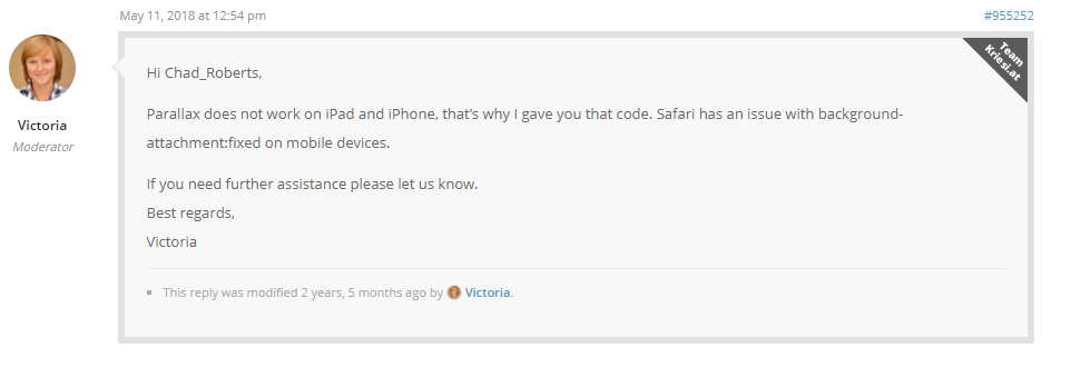
The feature concerns the display of fixed or parallax background images on mobile browsers. iOS Safari cannot render these backgrounds because the platform blocks the JavaScript that drives the animation. The limitation is confined to iPhone and iPad devices; Android phones, tablets, Chrome OS devices, and Windows tablets show the effect correctly.
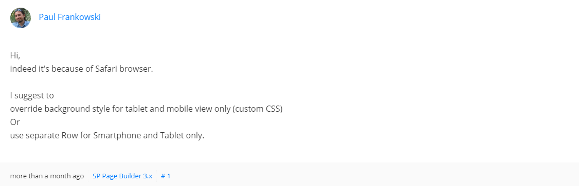
Within HighLevel you can avoid the issue by adding a separate section that is shown only on mobile devices. In that mobile section you assign a background image and choose a background setting other than the Parallax option. This way the page displays correctly on iOS while preserving the intended design for other devices.
The workaround is configured in the page editor where sections are defined. No additional code or external tools are required; the platform’s section settings control which background style is applied per device.
03How businesses use fixed / parallax background images
- Digital marketing agency. The agency creates a landing page with a parallax hero image for desktop users. To keep iPhone visitors from seeing a broken background, the team adds a mobile only section and selects a static background instead of Parallax.
- Ecommerce store. The store’s product showcase uses parallax scrolling on larger screens. For iPhone shoppers, a separate mobile section is added where the same image is displayed with a regular background setting, ensuring the image appears correctly.
- Local service business. A plumber builds a service page with a fixed background banner. Because iOS visitors cannot view it, the plumber adds a mobile specific section and picks a non parallax background, preserving the visual impact across all devices.
04How to set up and use fixed / parallax background images in HighLevel
Set up mobile specific section to avoid parallax issues
- Add a new section that will be displayed on mobile devices.
- Place your desired background image inside this mobile section.
- In the mobile section settings, choose a background option that is not Parallax.
05What it looks like in HighLevel
06Things to know before you rely on it
- iOS Safari cannot render fixed or parallax background images due to a browser limitation.
- The limitation blocks the JavaScript required for the animation, so the image disappears on iPhone and iPad.
- The problem does not affect Android phones, Chrome OS devices, or Windows tablets.
07If something goes wrong
- Parallax background image does not appear on iPhone or iPad.. Create a separate mobile only section and select a background style other than Parallax for that section.
08How it connects to the rest of HighLevel
- Review mobile settings before launching a website in HighLevel Mobile settings overview
- Explore all features available for Sites in HighLevel All Sites features
- View HighLevel pricing and plan options Pricing page
Michael's take

A tiny tweak can keep your site looking sharp on iPhones without overhauling the whole design. Swapping the mobile section to a static background sidesteps the iOS block and still lets desktop visitors enjoy the depth effect.
Think of a boutique that relies on visual storytelling. Like a design studio showcasing portfolios. The desktop page can glide with parallax, while the iPhone view uses a simple image. That balance keeps the brand polished across devices.